A more recent unmarked burial pit at Fengate contained three disarticulated burials and one, crouched, the latter with a leaf-shaped arrowhead still sticking between the eighth and ninth ribs.The warmer clime was conducive to the spread of agriculture and an increasing density of population. The cutting of the land bridge, and the slow flooding of what later became the Dogger Bank, in the North Sea, had a personal consequence. Figure 7. The location of Doggerland about 7000 BP (Bryony Coles via doggerland) My Y-chromosome has been designated as R1b1b2a1a1d*, which is a variety of Celt, that, as I have mentioned in an earlier post, had come down from Cro-Magnon man. The analysis that has evolved over the past few years (apparently starting at 23andme suggests that this a “Freisian” variety of Celt and there is a body of thought moving to the conclusion that they were the inhabitants of Doggerland that were driven to Britain when the final inundation occurred around 5500 years ago, just before the first circles at Stonehenge were constructed. (And here I now discover that maybe I wasn’t the first of my lineage to work on a Stonehenge). The first circles at Stonehenge were developed about 5,000 years ago (at the left side of Figure 4). But around 2150 BC or some 4000 BP the Beaker People arrived. In contrast with those, maybe us, who had first developed the site and were moon worshipers, they worshiped the sun. What made the Stonehenge site become what it did was that the simple markers already there to align critical lunar phases could, by moving around the circle ninety degrees, also align to the major solar alignments at mid-winter, mid-summer etc. The ruling elites of the time became more powerful, and with the warmer climes helping sustain agricultural production, society became more static. And the more powerful had enough manpower available to develop, over the next millennium or so, the full glory that became Stonehenge. They also grew into the Wessex Culture with its elaborate and rich graves. The Beaker People were Celts and still, at the beginning of this time, used stone axes and flint-shaped arrowheads. But copper daggers are found even in the earliest graves and this was the time where the culture was moving into the Bronze Age in Britain, some time after it had developed elsewhere in Europe. Given that the Red Paint People were aware of native copper deposits, (and were starting to make small ornaments with them) had they known of the metal forming traditions developing in Europe then metal objects would have shown up in the graves. They did not, and even to the time of Champlain stone tools were in use. So it is logical to conclude that seafaring though the cultures were on both sides of the Atlantic they did not communicate at this time, at least not well enough to teach metal craft, at a time when it might have been easier to travel, from one side of the Atlantic to the other. On the other hand, it might be possible to conjecture an explanation for the long and narrow bayonet points which Dr. Bourque points out as a significant feature of Red Paint burials. He notes that these are too weak to have any great utilitarian value in society, because they were made of stone. He therefore suggests that they had only a ceremonial aspect that has been lost. But it could be that they were an attempt to copy the spear heads that were beginning to be developed in Britain at the time, but which were made utilitarian only by being made of metal. And that would suggest some form of communication between the two societies. There remain a couple of additional thoughts, both about the ability of early societies such as these to travel long distances, and the mysterious disappearance of whole societal segments. But they arise in events in Greenland that happened during the Medieval Warming Period; the migration of the Thule from Alaska to Northern Greenland in 1000 AD, and the abandonment of the Western Settlement of the Viking in Greenland. Since this is a different time period I will therefore leave those topics to a subsequent post.
Showing posts with label MWP. Show all posts
Tuesday, November 6, 2012
The Red Paint People, Doggerland and my DNA.
Over the last couple of months I have been putting up the occasional post on my own family tree, as it is becoming defined by DNA analysis, and at the same time have been looking at some of the early arrivals of Indians in Maine and the North East American continent. (My interest in the latter was initiated by the question of when Europeans first arrived on the continent in enough numbers to influence facial features of the locals).
Two weeks ago I was fortunate to be able to attend a lecture by Bruce Bourque, the Curator of Archaeology at Maine State Museum, and the authority on the Red Paint People, of whom I have written earlier with a follow-up post on their travels. His talk, and the book he just recently released (The Swordfish Hunters) provides much more detail on a people that have largely been neglected by “the archaeologists of Harvard,” who have tended to disregard significant developments this far north of Boston.
The Red Paint People are also called “the Moorehead Phase”, after Warren Moorehead, who first identified them as the “Red Paint” people, because of their custom of burying red ocher with the bodies in their cemeteries. They flourished in a small part of Maine, and their cemeteries have been found along the banks of local rivers. There is, however considerable evidence that they harvested fish and sea-food (their cemeteries have been found in large shell middens), with a peculiarity that they also hunted, ate and used the bones and rostra (the “sword”) of local swordfish. The latter, in particular, was used to provide a stiffened mount behind the harpoon and spear tips used in hunting. They appear to be the first to hunt swordfish, which would have been a dangerous prey for early Holocene man, since they have a nasty habit of attacking the boats of those who have just stabbed them with a harpoon.
Figure 1. Red Paint Cemeteries in North-East America (The Swordfish Hunters)
The book is a fascinating story of detective work, and archaeology as it builds a picture of a people that began around 5,000 years ago and suddenly disappeared around 3,800 years ago. Dr. Bourque points to evidence that it does not fit within an overall unified culture which has been described as the Maritime Archaic, but rather stands on its own, and emerges from the “Small Stemmed Point” tradition that preceded it. But is totally separate from the Ceramic period that follows.
One of the intriguing parts of the story lies in the thousand-mile link with the Ramah Peninsula in Labrador, that I discussed in a previous post, and Dr. Bourque also points to close similarities between the findings in Maine, and those at the Port au Choix site. One identifying characteristic lies in the development of stone gouges, for use in hollowing out the inside of dugout canoes.
Figure 2. A Stone Gouge from Maine, and an artist’s rendition of how it would be hafted. (The Swordfish Hunters).
The gouges, as the book argues, show that the Red Paint Peoples were building substantial canoes and boats around 4,000 years ago, that were substantial enough for voyages of a thousand miles, and that this would also make them viable for use in harpooning swordfish (an art in itself as the book illustrates).
The climate change around the time that this culture was flourishing in Maine is not seriously discussed in the book, but I think that it is worth looking at, in context, because it ties in a little with what was happening across the Atlantic, where the culture that built Stonehenge had moved into Britain.
Figure 3. Climate swings in the Northern Hemisphere over the past 10,000 years (the Holocene) (Consulting Geologist)
The significance of these temperature variations is often significantly discounted as climate scientists today would rather emphasize the point of the effects imposed by man, rather than the natural effects we cannot control. Yet the higher temperatures that did exist, even as recently as the last (Medieval) Warming Period are evidenced, for example, by the recent uncovering of an Eskimo village which has been buried under a glacier for the past 500 years. The inhabiting tribe of Yup’ik Eskimo lived, among other things, on caribou and lived at Quinhagak in Alaska. Without the protective ice cap that has covered the site from the time that the Yup’ik left there at the beginning of the Little Ice Age, the site is now rapidly being eroded into the Bering Sea (a fate that is similarly threatening the sites in Maine, where coastal erosion and sea level changes have covered most of the Red Paint People’s locations). But it indicates that we are only now reaching the temperatures at that site that prevailed in the Medieval Warming Period.
The Red Paint People lived at the beginning of what is now referred to as the Minoan Warming Period. And, from data obtained from the Greenland Ice Cores, it is possible to note a couple of facts about the time that the tribe appears to have vanished. First, if the temperatures, as derived from the Ice cores recovered from Greenland are examined in a little more detail:
Figure 4. Temperatures in the region over the last 5,000 years (from the Greenland GISP2 Ice core)
Perhaps more to the point, if the extent of sea ice at the time is considered (from the same source) it fell to an historic low during the Minoan.
Figure 5. Sea Ice extent over the Holocene (The Ice Chronicles ) (Note the plot has been flipped, relative to the original, in order to conform to the consistency of showing the older period to the left of the plot in the rest of the post).
With this considerable warming the ice retreated from the shores of Greenland, and it became an even more hospitable place that it was at the time almost 3,000 years later when Erik the Red came calling. This warming had another consequence, because it led to a steady rise in the levels of the sea. This is shown in the book as it affects Maine, important since it shows how the shoreline dwellings from the period have since been inundated.
Figure 6. Sea levels off the coast of Maine over the Holocene (The Swordfish Hunters)
But in Europe that sea rise from the beginning of the Holocene had another consequence. It flooded the land-bridge (known as Doggerland) between what became the isle of Britain and the continent.
Within the British Isles, by 4,000 BP the country had been colonized for about a thousand years by the arrival of an agricultural movement that displaced the earlier hunter-gatherers and, in turn. rapidly changed from a “slash and burn” land clearance into the development of a “celtic arrangement of fields. Colin Burgess in "The Age of Stonehenge" has noted that the settlements towards the end of that transition were already being constructed defensively.
Read more!
Labels:
bayonet,
Beaker People,
Celt,
Cro-Magnon man,
Doggerland,
Labrador,
Maine,
Minoan Warming Period,
MWP,
Red Paint,
Sea level,
Stonehenge
Monday, November 28, 2011
Climategate 2, more unethical Team behavior
The second batch of e-mails, (Climategate 2)(you have to register) documenting the “behind the scenes” activities of the scientists that have been some of the stronger advocates for the uniqueness of current global warming over the last two millennia have been released. They have now been perused in running series of posts at various blog sites, and, while there is no immediately obvious major new revelation, the contemptible behavior of these purportedly exemplary individuals is getting an increasing amount of sunlight. It also shows how thick the whitewash was in the “enquiries” into scientific misconduct that followed the release of the original, Climategate 1, e-mails.
As an example, New Zealand Climate Change has shown in two posts ( here and here) how “reputable” scientists (Phil Jones, Michael Mann, Jim Salinger, Tom Wigley, Barrie Pittock, Mike Hulme and others – i.e. "the Team") worked to get Chris de Freitas, then editor of the journal Climate Research fired from that position, and also worked to try and get him fired from his academic position. His “crime” was to allow, following peer review, a paper that challenged the validity of the initial Mann “hockey stick” paper and its conclusions that the late 20th century was the warmest of the last millennium. (That particular conclusion was later changed, by Dr Mann, though much later than these events).
To explain the heinous nature of this particular activity requires some background, and also some information that has only since emerged. And, for the sake of brevity I am only going to summarize the story, though adding some detail not in the NZ post.
At the beginning of the story, back in 1997, the state of historical climate science thinking was that between AD 900 and AD 1300 (roughly) the world was going through a warming period, roughly akin to that we are currently seeing, and known as the Medieval Warming Period (MWP). This was followed by a much colder period that lasted from AD 1400 to AD 1800, known as the Little Ice Age (LIA). Evidence for this can, for example, be found in a study that was carried out looking at the sediments laid down in lakes in Finland. In 2005 Mia Tiljander submitted her thesis on these sediments in which she found, in concurrence with earlier studies of sediments in other lakes in the region that:
Global Temperature plot from the first IPCC report (IPCC via John Daly )
This picture was challenged with the publication by Michael Mann, Raymond Bradley and Malcolm Hughes of a paper in Nature in 1998 (MBH 1998) that introduced the “Hockey Stick” plot to the world. Contrary to the prevailing opinion this paper suggested that there was a steady decline in temperatures from 1000 AD to around 1850 AD (the handle of the hockey stick), following which temperatures rose steadily to their present high levels (the blade).
The original “Hockey Stick” from MBH 1998 (MBH via John Daly ) (Note the thickness of the green error bars).
This plot made it easier to argue that current temperatures were a direct cause of industrial activity, due to the generation of increasing levels of carbon dioxide as the world used more fossil fuel. And, as a result, MBH concluded:
To sustain the credibility of this plot, the warming of the MWP, and the cooling of the LIA, had to be minimized. Both the initial set of e-mails and the new set document that the Team recognized and worked to do this. One immediate challenge was to respond to a paper published in 2003 in the journal Climate Research by Willie Soon and Sallie Baliunas which had looked at some of the previous data (which MBH 1998 had neither considered nor shown invalid) to conclude that:
The lack of objectivity of the editors of the journals in which the Team publish(such as Science, for example) is shown by theTeam being solicited by the journals to write opposing articles for them, as a counter to the Soon/Balianas paper. (e-mail 2469).
The Team were still not satisfied, and as the New Zealand post points out, they suggested that a letter be sent to the head of the University at which Dr de Freitas works, (e-mail 3052)
Let me, however, end this rather lengthy post with another piece of Team dishonesty. You may remember that I began by quoting Mia Tiljander’s work on Finnish lake sediments. Well due to an odd circumstance, when this was examined by the Team the results were inverted. As a result, instead of showing the MWP that actually existed, her results were included as showing that it did not.
This was admitted in the first Climategate release (e-mail 3511) where Darrell Kaufman wrote
Courtesy of Climate Audit, you can judge for yourselves, comparing perhaps to the top figure, as to whether inverting the data made any difference.
How using the Tiljander data properly (New) reveals the MWP and LIA (Tiljander via Climate Audit), while the Team use (Old) hides them.
In further discussion the more recent sediments (which Tiljander noted were disturbed) which upticked in the “OLD” incorrect use, continued to be used by the team. As Andrew Montford noted in "The Hockey Stick Illusion", however:
And a short P.S. Steve McIntyre has just posted that the Team tried the same nasty tricks to try and discredit Willie Soon at Harvard.
As an example, New Zealand Climate Change has shown in two posts ( here and here) how “reputable” scientists (Phil Jones, Michael Mann, Jim Salinger, Tom Wigley, Barrie Pittock, Mike Hulme and others – i.e. "the Team") worked to get Chris de Freitas, then editor of the journal Climate Research fired from that position, and also worked to try and get him fired from his academic position. His “crime” was to allow, following peer review, a paper that challenged the validity of the initial Mann “hockey stick” paper and its conclusions that the late 20th century was the warmest of the last millennium. (That particular conclusion was later changed, by Dr Mann, though much later than these events).
To explain the heinous nature of this particular activity requires some background, and also some information that has only since emerged. And, for the sake of brevity I am only going to summarize the story, though adding some detail not in the NZ post.
At the beginning of the story, back in 1997, the state of historical climate science thinking was that between AD 900 and AD 1300 (roughly) the world was going through a warming period, roughly akin to that we are currently seeing, and known as the Medieval Warming Period (MWP). This was followed by a much colder period that lasted from AD 1400 to AD 1800, known as the Little Ice Age (LIA). Evidence for this can, for example, be found in a study that was carried out looking at the sediments laid down in lakes in Finland. In 2005 Mia Tiljander submitted her thesis on these sediments in which she found, in concurrence with earlier studies of sediments in other lakes in the region that:
During the Roman period there was in AD 140-220 an 80-year-long period in the Lake Korttajärvi area when organic matter deposition and the sedimentation was similar to that during the Medieval Warm Period (MWP), interpreted as milder climate condition. After this period, a clear mineral matter – organic matter varve structure existed, until the beginning of the MWP.In light of subsequent discussion of her work (which comes later) it should be noted that the disturbance of the annual sediment layers (the varves) by human activity only occurred in sediments after AD 1720, i.e. towards the end of the LIA. The picture of the historic climate can thus be outlined, as it was understood, by a plot from the first IPCC report.
The MWP, AD 980-1250, was an exceptional period. The MWP is characterized by thinly laminated varves rich in organic matter, almost lacking the mineral pulses (i.e. spring floods), indicating mild climatic conditions. This period was interrupted by a colder period from AD 1115- 1145, dominated by mineral-matter-rich varves. The sediment deposited during the MWP was highly organic and dark brownish in colour. Based on pollen and diatom studies (Kauppila 2002), the MWP was a two-stage event. AD 980-1100 was warm and dry, a cold spell (AD 1115-1145) interrupted the warm trend and the following period AD 1145-1220 was again warm and even drier than the first stage.
Global Temperature plot from the first IPCC report (IPCC via John Daly ) This picture was challenged with the publication by Michael Mann, Raymond Bradley and Malcolm Hughes of a paper in Nature in 1998 (MBH 1998) that introduced the “Hockey Stick” plot to the world. Contrary to the prevailing opinion this paper suggested that there was a steady decline in temperatures from 1000 AD to around 1850 AD (the handle of the hockey stick), following which temperatures rose steadily to their present high levels (the blade).
The original “Hockey Stick” from MBH 1998 (MBH via John Daly ) (Note the thickness of the green error bars).This plot made it easier to argue that current temperatures were a direct cause of industrial activity, due to the generation of increasing levels of carbon dioxide as the world used more fossil fuel. And, as a result, MBH concluded:
Our results suggest that the latter 20th century is anomalous in the context of at least the past millennium. The 1990's was the warmest decade, and 1998 the warmest year, at moderately high levels of confidence.This conclusion and the elimination of the MWP and LIA, despite the fact that the curve and conclusion over-rode the combined papers of hundreds of scientists who had worked to validate their existence, was seized upon by the Global Warming community and used without further discussion, as the “New Bible.” It was, for example, prominently featured in the 2000 Third Assessment Report of the IPCC. I have seen it used by the current Secretary of Energy as the valid plot of temperatures over the past millennium and thus as justification for the programs he espouses. And this despite the torrent of valid criticism of the curve, and that the original plot only referred to the Northern Hemisphere.
To sustain the credibility of this plot, the warming of the MWP, and the cooling of the LIA, had to be minimized. Both the initial set of e-mails and the new set document that the Team recognized and worked to do this. One immediate challenge was to respond to a paper published in 2003 in the journal Climate Research by Willie Soon and Sallie Baliunas which had looked at some of the previous data (which MBH 1998 had neither considered nor shown invalid) to conclude that:
Furthermore, the individual proxies can be used to address the question of whether the 20th century is the warmest of the 2nd millennium locally. Across the world, many records reveal that the 20th century is probably not the warmest nor a uniquely extreme climatic period of the last millennium.Such effrontery and direct challenge to the authority of the team could not go unanswered, and the Team swung into action, (e-mail 31 ). It is interesting to note that in that correspondence Phil Jones recognizes the work of Jean Grove, an early climate scientist, (who reviewed the data validating the presence of The Little Ice Age in an excellent seminal book), but who died in 2001).
What we want to write is NOT the scholarly review a la Jean Grove (bless her soul) that just reviews but doesn't come to anything firm. We want a critical review that enables agendas to be set.Which was not how I remembered the text at all, and so I re-read the beginning of that book, and it shows that he was wrong in that statement. Dr. Grove wrote:
Historical evidence of Little Ice Age events is much more plentiful in Europe than elsewhere but the documentation from other continents though scantier, is supported by a great volume of field evidence (e.g. Hope et al 1976, Hastenrath 1984) which is presented in Chapters 7, 8 and 9. It emerges that the Little Ice Age was a global phenomenon and it is shown in Chapter 10 that it was not unique to the Holocene.But it was not just enough to write a rebuttal paper (which would be normal scientific practice). Although a rebuttal paper was written, with Tom Crowley suggesting that it be in EOS, this was not considered sufficient. Beginning with an e-mail from Mike Hulme (e-mail 2272) ) the Team began to focus on the editor, Chris de Freitas, who had accepted the paper.
Whilst we do not know who reviewed the Soon/Baliunas manuscript, there is sufficient evidence in my view to justify a "loss of confidence" in the peer review process operated by the journal and hence a mass resignation of review editors may be warranted. This is by no means a one-off - I could do the analysis of de Freitas's manuscripts if need be.Pressure was brought to bear, initially forcing changes in the editorial practices at the Climate Research journal, and then leading to the resignations of the editor in Chief (Hans von Storch) as well the one who accepted the paper (Chris de Freitas), and two others (Clare Goodess – who was at the University of East Anglia with the CRU group and Mitsuru Ando) who protested the publication, and who were encouraged to resign by the Team (e-mail 4808). It led to an editorial by the publisher, explaining why they could not allow the publication of papers in the journal to be governed by individuals outside the peer-review process (i.e. Team members).
I am contacting the seven of you since I know you well and believe you may also have similar concerns to me about the quality of climate change science and how that science is communicated to the public. I would be interested in your views on this course of action - which was suggested in the first place my me, once I knew the strength of feeling amongst people like Phil Jones, Keith Briffa, Mike Mann, Ray Bradley, Tom Crowley, etc. CSIRO and Tyndall communication managers would then think that a mass resignation would draw attention to the way such poor science gets into mainstream journals.
The lack of objectivity of the editors of the journals in which the Team publish(such as Science, for example) is shown by theTeam being solicited by the journals to write opposing articles for them, as a counter to the Soon/Balianas paper. (e-mail 2469).
Phil Jones and I are in the process of writing a review article for Reviews of Geophysics which will, among other things, dispel the most severe of the myths that some of these folks are perpetuating regarding past climate change in past centuries. My understanding is that Ray Bradley, Malcolm Hughes, and Henry Diaz are working, independently, on a solicited piece for Science on the "Medieval Warm Period".Of course, since then, Mann among others, has admitted to the presence of an MWP and an LIA, but it is a little late . . .
The Team were still not satisfied, and as the New Zealand post points out, they suggested that a letter be sent to the head of the University at which Dr de Freitas works, (e-mail 3052)
I have had thoughts also on a further course of action. The present Vice Chancellor of the University of Auckland, Professor John Hood (comes from an engineering background) is very concerned that Auckland should be seen as New Zealand's premier research university, and one with an excellent reputation internationally. He is concerned to the extent that he is monitoring the performance of ALL his senior staff, from Associate Professor upwards, including interviews with them. My suggestion is that a band of you review editors write directly to Professor Hood with your concerns. In it you should point out that you are all globally recognized top climate scientist. It is best that such a letter come from outside NZ and is signed by more than one person.The e-mail goes on to suggest the form of the letter that should be sent:
Instead we have discovered that this person has been using his position to promote ‘fringe’ views of various groups with which they are associated around the world. It perhaps would have been less disturbing if the ‘science’ that was being passed through the system was sound. However, a recent incident has alerted us to the fact that poorly constructed and uncritical work has been allowed to enter the pages of the journal.The strength of the punishment that the Team inflicted on the journal and those associated with the story kept the peer reviewed papers “in line” for some time, and so it has only this last September (after some 8 years) that it has been necessary to force the resignation of another editor, Wolfgang Wagner, to remind the scientific press as to who is in charge here.
A recent example has caused outrage amongst leading climate scientists around the world and has resulted in the journal dismissing (??).. from the editorial board. We bring this to your attention since we consider it brings the name of your university and New Zealand into some disrepute. We leave it to your discretion what use you make of this information.
Let me, however, end this rather lengthy post with another piece of Team dishonesty. You may remember that I began by quoting Mia Tiljander’s work on Finnish lake sediments. Well due to an odd circumstance, when this was examined by the Team the results were inverted. As a result, instead of showing the MWP that actually existed, her results were included as showing that it did not.
This was admitted in the first Climategate release (e-mail 3511) where Darrell Kaufman wrote
Regarding the "upside down man", as Nick's plot shows, when flipped, the Korttajarvi series has little impact on the overall reconstructions. Also, the series was not included in the calibration. Nonetheless, it's unfortunate that I flipped the Korttajarvi data.In fact that is not a completely true statement either, since, as Mia Tiljander noted, the original data clearly showed an MWP, and if the data was good enough to use inverted to disprove that it existed, surely it should also be used to prove its presence when turned the right way around. But as Steve McIntyre has noted on the subject, while the original perpetrator may have submitted a correction the good Dr Mann has yet to admit that he used data improperly.
Courtesy of Climate Audit, you can judge for yourselves, comparing perhaps to the top figure, as to whether inverting the data made any difference.
How using the Tiljander data properly (New) reveals the MWP and LIA (Tiljander via Climate Audit), while the Team use (Old) hides them. In further discussion the more recent sediments (which Tiljander noted were disturbed) which upticked in the “OLD” incorrect use, continued to be used by the team. As Andrew Montford noted in "The Hockey Stick Illusion", however:
The big selling point of Mann’s new paper was that you could get a hockey stick shape without tree rings. However, this claim turned out to rest on a circular argument. Mann had shown that the Tiljander proxies were valid by removing them from the database and showing that you still got a hockey stick. However, when he did this test, the hockey stick shape of the final reconstruction came from the bristlecones. Then he argued that he could remove the tree ring proxies (including the bristlecones) and still get a hockey stick – and of course he could, because in this case the hockey stick shape came from the Tiljander proxies. His arguments therefore rested on having two sets of flawed proxies in the database, but only removing one at a time. He could then argue that he still got a hockey stick either way.
And a short P.S. Steve McIntyre has just posted that the Team tried the same nasty tricks to try and discredit Willie Soon at Harvard.
Read more!
Labels:
Climategate,
e-mails,
hockey stick,
Jean Grove,
LIA,
Michael Mann,
MWP
Saturday, December 5, 2009
Popular Mechanics is wrong!
Hmm! Incited, I must admit, by a comment the Advocate made on his web-site, in which, via Andrew Sullivan, he approves of the “dispassionate” review of Climategate given in the last edition of Popular Mechanics – I am going to try and explain why that article is, in fact, almost totally wrong. (And incidentally did you know that Dr Kelemen, who wrote it, shares a department at Columbia University with Dr James Hansen - he who is one of the strongest advocates of AGW on the planet. Sigh!)
The article states, in its summary
However, at the moment, having (I suspect) taken a look at the reality of mess that was the code that was being used at CRU the Met Office has decided to clean its slate and start over, which is a commentary in itself.
Unfortunately this does not address the underlying issue – and which Peter Kelemen fails to grasp. It is this. There has been a clear pattern of global warming and cooling in about 1,000 to 1,500 year cycles for some millennia. From about 1350 to about 1850 the globe was in a period called a Little Ice Age. There are literally hundreds of scientific documents that record this. The ones that I am more often prone to quote are collected in Jean Grove’s Book The Little Ice Age. The world started coming out of this colder time about 160 years ago, so the Met Office survey is going to show that the globe has, yes indeed, been warming over that time frame.
But the question that gets neglected in that reaffirmation is based on the reason for the warming. Because if indeed the world is naturally going through this cycle, then the Anthropogenic part of AGW becomes questionable. Carbon dioxide levels were not changing as this part of the cycle started – they are not thought to have been a significant factor until around 1980, by which time the globe had been warming for over a hundred years. (And in the 1960’s – which is where Peter would have us consider that greenhouse effects started to have an impact - the world was apparently (according to the now questionable record) in the midst of a cooling period that lasted from about 1940 to about 1970).
Further, before the Little Ice Age there is considerable evidence that the globe was warmer, on average, than it is now. And in that period life did not come to an end. There was no great invasion of the sea over vast areas of land. Yes, there were droughts in places such as Southern California but there was no great eruption of methane from the melting tundra, as has been prophesied as an example by many of those now writing about the terrors that Global Warming will bring. The period was known as the Medieval Warming Period, and even Dr. Mann, in a paper published last week, has finally admitted to its existence.
The implication in the statement in Popular Mechanics is that it is the greenhouse effect that is driving climate change, and that the natural effects are merely assisting in encouraging the change. In reality it is the other way around. As lots of scientists have pointed out, over most of the history of the Earth it is only after the temperature has risen that carbon dioxide levels rise, not, as many AGW proponents would have it, the other way around.
The recent halt in the rapid rate of global warming that we saw until 1998 points out the errors in accepting the arguments of advocates of AGW such as Dr Hansen, whose predictions had the average temperature increase due to the greenhouse effect already over 1.1 degrees C, when in fact it is around 0.5 degrees C, below the level that Dr Hansen had predicted it would reach only if carbon dioxide levels were dramatically reduced in 2000, which they were not.
I suspect that we will see many similar articles by apologists for the AGW crowd of the ilk of the Popular Mechanics article in the coming weeks. We can only hope that those reporting on the issue become a little more dispassionate in their reporting. Unfortunately based on the record to date I would not place any money on it happening – but regrettably, with the money being committed to the climate change business, the world is not likely to have that luxury.
The article states, in its summary
A good-faith effort has been made to determine average global temperature using the instrumental record, with increasing accuracy and precision as the data become more comprehensive. For sure, the average temperature of the atmosphere has been rising for most of the last 50 years. This is consistent with the greenhouse theory, though one cannot rule out with complete certainty that other factors—variation due to sunspot activity, or the last gasp of a long warming trend caused by variation in the Earth's orbit—might also be contributing to temperature change.OK, let’s start there and progress, because the e-mails and sections of code that are being revealed show that the “good-faith” bit is already somewhat of a stretch. But before I get there let me explain a couple of things that may not be that well known. To begin with there are not that many places that actually monitor the temperature of the globe, or are used as the sources of record. The two that have been most consistently used are that run by NASA’s Goddard Institute for Space Studies (GISS) and that of the Climate Research Unit at the University of East Anglia (CRU) affiliated with the British Met Office, though there is a third at the National Climatic Data Center (NCDC) which is part of NOAA. (This last tends to run very close to the GISS values). The British Met Office, in trying to ameliorate the mess that has suddenly been dumped in their lap has tried to explain how these records are made.
However, at the moment, having (I suspect) taken a look at the reality of mess that was the code that was being used at CRU the Met Office has decided to clean its slate and start over, which is a commentary in itself.
The Met Office plans to re-examine 160 years of temperature data after admitting that public confidence in the science on man-made global warming has been shattered by leaked e-mails.
The new analysis of the data will take three years, meaning that the Met Office will not be able to state with absolute confidence the extent of the warming trend until the end of 2012.
Unfortunately this does not address the underlying issue – and which Peter Kelemen fails to grasp. It is this. There has been a clear pattern of global warming and cooling in about 1,000 to 1,500 year cycles for some millennia. From about 1350 to about 1850 the globe was in a period called a Little Ice Age. There are literally hundreds of scientific documents that record this. The ones that I am more often prone to quote are collected in Jean Grove’s Book The Little Ice Age. The world started coming out of this colder time about 160 years ago, so the Met Office survey is going to show that the globe has, yes indeed, been warming over that time frame.
But the question that gets neglected in that reaffirmation is based on the reason for the warming. Because if indeed the world is naturally going through this cycle, then the Anthropogenic part of AGW becomes questionable. Carbon dioxide levels were not changing as this part of the cycle started – they are not thought to have been a significant factor until around 1980, by which time the globe had been warming for over a hundred years. (And in the 1960’s – which is where Peter would have us consider that greenhouse effects started to have an impact - the world was apparently (according to the now questionable record) in the midst of a cooling period that lasted from about 1940 to about 1970).
Further, before the Little Ice Age there is considerable evidence that the globe was warmer, on average, than it is now. And in that period life did not come to an end. There was no great invasion of the sea over vast areas of land. Yes, there were droughts in places such as Southern California but there was no great eruption of methane from the melting tundra, as has been prophesied as an example by many of those now writing about the terrors that Global Warming will bring. The period was known as the Medieval Warming Period, and even Dr. Mann, in a paper published last week, has finally admitted to its existence.
The implication in the statement in Popular Mechanics is that it is the greenhouse effect that is driving climate change, and that the natural effects are merely assisting in encouraging the change. In reality it is the other way around. As lots of scientists have pointed out, over most of the history of the Earth it is only after the temperature has risen that carbon dioxide levels rise, not, as many AGW proponents would have it, the other way around.
The recent halt in the rapid rate of global warming that we saw until 1998 points out the errors in accepting the arguments of advocates of AGW such as Dr Hansen, whose predictions had the average temperature increase due to the greenhouse effect already over 1.1 degrees C, when in fact it is around 0.5 degrees C, below the level that Dr Hansen had predicted it would reach only if carbon dioxide levels were dramatically reduced in 2000, which they were not.
I suspect that we will see many similar articles by apologists for the AGW crowd of the ilk of the Popular Mechanics article in the coming weeks. We can only hope that those reporting on the issue become a little more dispassionate in their reporting. Unfortunately based on the record to date I would not place any money on it happening – but regrettably, with the money being committed to the climate change business, the world is not likely to have that luxury.
Read more!
Labels:
AGW,
Dr Hansen,
Dr Mann. CRU,
Little Ice Age,
MWP,
Popular Mechanics
Saturday, November 28, 2009
ClimateGate - and Dr Mann's changing story
The main stream media are still largely hiding the scope of the revelations from Climategate – it is much more important to them, for example, to discuss the couple that gatecrashed a dinner (the Washington Post); that Mayor Michael Bloomberg spent $102 million being re-elected (New York Times); that Tiger Woods crashed his car – but wasn’t hurt (LA Times); or that Pandas got a warm welcome when they moved to Australia for ten years (BBC News).
Commentators have largely tiptoed around the issue. It is interesting to note that Andrew Freedman at WaPo claims to be willing to view both sides, yet puts up interviews with two apologists for the “disinformation” side and promises to put up a skeptical viewpoint “in coming days.” (Perhaps by then the furor will have died down and it won’t have to be too strong a skeptic). And Eugene Robinson is willing to continue the insults:
In the e-mails that were “released” from the University of East Anglia it is clear that the reliance on tree-ring data, one of the fundamental legs to the data that went into the development of the Mann, Bradley, and Hughes “hockey stick” paper, is unreliable. Those putting out the papers (and judging whether other papers should be published) clearly knew this, but went on using it anyway. As proof thereof Dr Michael Mann and his group have just issued another paper. - but now there is a change. Whereas for the past few years those of us who brought up the existence of the Medieval Warming Period were subject to abuse and ad hominem attacks, it now appears that perhaps the "Power That Is" has changed his mind. In the new paper, the faithful are called to a new recognition:
Interestingly one of the things that the “new” review of data that has Dr Mann “discovering” the MWP is that his models now project:
All those folk who have been saying that the models had shown that there were no major impact due to solar changes are going to have to do a little backpeddling now that the High Priest has spoken:
Unfortunately, at that time, I suspect that folk such as Mr Robinson, will continue to think of those of who demurred earlier as still being evil and wrong, but will just conclude that the scientists that they believed in were also wrong and conclude that scientists as a whole behave this way. It will be difficult to convince them that they are wrong – even as it has proved in the last week, where denial of the meaning of these revelations has remained quite widespread. So what to call those who remain in that state?
Commentators have largely tiptoed around the issue. It is interesting to note that Andrew Freedman at WaPo claims to be willing to view both sides, yet puts up interviews with two apologists for the “disinformation” side and promises to put up a skeptical viewpoint “in coming days.” (Perhaps by then the furor will have died down and it won’t have to be too strong a skeptic). And Eugene Robinson is willing to continue the insults:
Stop hyperventilating, all you climate-change deniers. The purloined e-mail correspondence published by skeptics last week -- portraying some leading climate researchers as petty, vindictive and tremendously eager to make their data fit accepted theories -- does not prove that global warming is a fraud.But unfortunately does not recognize some of the implications to the revelations.
It would be great if this were all a big misunderstanding. But we know carbon dioxide is a greenhouse gas, and we know the planet is hotter than it was a century ago. The skeptics might have convinced one another, but so far they haven't gotten through to the vanishing polar ice.Well, apart from the fact that the total sum of Arctic and Antarctic Ice hasn’t been changing much – in fact Antarctic ice sheet size has been growing – this fails to grasp an underlying change that is happening among the warmers. (It is perhaps a little early to start to find the same sort of pejorative title for folk that manipulate and hide data to promote their point of view, as has been given to those skeptics such as myself that question some of the data).
In the e-mails that were “released” from the University of East Anglia it is clear that the reliance on tree-ring data, one of the fundamental legs to the data that went into the development of the Mann, Bradley, and Hughes “hockey stick” paper, is unreliable. Those putting out the papers (and judging whether other papers should be published) clearly knew this, but went on using it anyway. As proof thereof Dr Michael Mann and his group have just issued another paper. - but now there is a change. Whereas for the past few years those of us who brought up the existence of the Medieval Warming Period were subject to abuse and ad hominem attacks, it now appears that perhaps the "Power That Is" has changed his mind. In the new paper, the faithful are called to a new recognition:
Mann and his colleagues reproduced the relatively cool interval from the 1400s to the 1800s known as the "Little Ice Age" and the relatively mild conditions of the 900s to 1300s sometimes termed the "Medieval Warm Period."Of course the paper notes that it wasn’t really that hot back then (though actually there is an e-mail or two that seems to contradict this). So does this mean that those of us who objected to the linear nature of the “hockey stick” line through both this periods will get some admission that we were right. Don’t rush to hold your breath. Nope they don’t have to get that honest! And for those who will head out to Copenhagen waving the original figure – do I anticipate that folk such as Energy Secretary Steven Chu will change his talks – well not really, at that level admitting error almost never happens.
Interestingly one of the things that the “new” review of data that has Dr Mann “discovering” the MWP is that his models now project:
The researchers note that, if the thermostat response holds for the future human-caused climate change, it could have profound impacts on particular regions. It would, for example, make the projected tendency for increased drought in the Southwestern U.S. worse.Now, and see my cynical nature come through here, I don’t suppose that this has anything to do with the historic record for what happened in those regions a thousand years ago when there were severe droughts that lasted up to a couple of hundred years. (There are tree remnants in the bottoms of lakes as proof I am not making this up).
All those folk who have been saying that the models had shown that there were no major impact due to solar changes are going to have to do a little backpeddling now that the High Priest has spoken:
The warmer conditions of the medieval era were tied to higher solar output and few volcanic eruptions, while the cooler conditions of the Little Ice Age resulted from lower solar output and frequent explosive volcanic eruptions.It used to be so much easier to make these changes in doctrine, when the vast majority of the populace couldn’t read. But of course there is reading and also there is understanding, and so I anticipate that we will continue to see obfustication and data manipulation for some time to come. And those within the press will take a while to realize that some of the cardinal points that have been used to secure their belief are not, in fact, likely going to prove true.
Unfortunately, at that time, I suspect that folk such as Mr Robinson, will continue to think of those of who demurred earlier as still being evil and wrong, but will just conclude that the scientists that they believed in were also wrong and conclude that scientists as a whole behave this way. It will be difficult to convince them that they are wrong – even as it has proved in the last week, where denial of the meaning of these revelations has remained quite widespread. So what to call those who remain in that state?
Read more!
Labels:
Climategate,
Dr. Chu,
Dr. Jones,
Eugene Robinson,
LIA,
Michael Mann,
MWP
Saturday, October 31, 2009
Dr Hansen was wrong - let's change the subject
I have pointed out in recent remarks, that if the debate on climate change were being conducted under normal scientific conventions, then the predictions that were made by Dr. Hansen back in 1988 would, by now, be considered to have been proved false, since the predictions that he made on global temperature rise, and the path that temperature would take, have not followed his models. His predictions were based upon:
Comparison of Dr Hansen’s scenario predictions against actual temperature anomalies (deg C) (prediction here and actual temp from GISS) Baseline 1951-1980 mean.
I took the data from the plot of temperature predictions that Dr Hansen provided, since it allows me to easily read the predicted temperatures, and I then re-plotted the data with the actual temperatures from the GISS website as the black lines, since the original plot only went as far as 2005. I did note that the tabulated data were slightly different from those of the actual temp data plotted in the 2005 curve, and used the more up to date ones for the entire series.
If one looks at the above comparison that Dr Hansen which is extended from the one made in 2005 the difference between the actual temperature and his predictions clearly show that the actual (black) temperatures are falling away from all but the C scenario (blue) a predictive future which was only supposed to occur if we did ameliorate carbon dioxide emissions. There is no accelerated warming, and there was no amelioration of the rising carbon levels, and so his predictions fail.
However, rather than discuss this rather interesting fact, the global “warming” community has managed, yet again, to divert discussion by dragging debate over a different topic of their choosing, so that this primary point can be hidden from public debate. Their topic centers on whether the globe has been warming at all, an issue that depends very much on where your temperature starts. They might have been somewhat embarrassed to begin with 1998 (as some more realistic of the proponents recognize, following their earlier use of that temperature to show how fast the temperature was going up). However the commentators have chosen, very carefully, to attack the suggestion that the temperature might be cooling, rather than the more relevant issue that the global temperature is not following the models. When you can’t argue, then change the subject.
Now, for what it is worth I have made clear that I am more convinced by the hundreds of peer-reviewed publications (such as those referenced by Jean Grove in The Little Ice Age, or by Brian Fagan in his books) that document the Medieval Warming Period and its predecessors and the intervening cold periods, such as those of the Dark Ages and the Little Ice Age. Thus the fact that the present warming period has not reached the extent of the last warming period, let alone those before it, does not unduly disturb me. (That is evidenced by the ground conditions – such as permafrost - in the Arctic inter alia, and the positions of the ecotones in Europe). Yet it is sadly a denigration of true scientific debate to see how vociferously those arguing for AGW change the topic, or readjust the data whenever they seem at the stage of losing a point in the debate.
If one accepts that we are in this cyclic series then arguments about whether by some fraction of a degree or other the temperature was warmer in 1934 than 2005 in the United States become significantly less critical. The question then becomes whether this Warming Period is significantly less warm than the last, or the one before that. The Roman period was apparently warmer than the Medieval one (the evidence coming among other things from the Roman ruins appearing out of the ice in the Alps), and both were warmer than we are now. But we also need to go back to those periods and see what the conditions were that developed in different parts of the globe (such as the extended droughts in what is now California) and learn from that information, and take precautions accordingly, recognizing what we might be facing as the climate changes. For if we do not learn from history, then we are bound to repeat it - as once was said.
The question as to why these periods existed – or whether the intervening cooling periods are the anomalies – is probably a much more worthwhile study, but given the urge that folk have to change the way in which energy is produced, and the vast fortunes that hang on the changes in policy that are being debated, somehow I don’t see much attention being given to those questions soon.
Scenario A assumes continued exponential trace gas growth, scenario B assumes a reduced linear growth of trace gases, and scenario C assumes a rapid curtailment of trace gas emissions such that the net climate forcing ceases to increase after the year 2000.The carbon dioxide path has continued to move along the path predicted for scenario A, yet the temperature rise through today has not only failed to accelerate with it, as Dr Hansen predicted, but instead is much closer to following along the temperature curve predicted for scenario C.
Comparison of Dr Hansen’s scenario predictions against actual temperature anomalies (deg C) (prediction here and actual temp from GISS) Baseline 1951-1980 mean.I took the data from the plot of temperature predictions that Dr Hansen provided, since it allows me to easily read the predicted temperatures, and I then re-plotted the data with the actual temperatures from the GISS website as the black lines, since the original plot only went as far as 2005. I did note that the tabulated data were slightly different from those of the actual temp data plotted in the 2005 curve, and used the more up to date ones for the entire series.
If one looks at the above comparison that Dr Hansen which is extended from the one made in 2005 the difference between the actual temperature and his predictions clearly show that the actual (black) temperatures are falling away from all but the C scenario (blue) a predictive future which was only supposed to occur if we did ameliorate carbon dioxide emissions. There is no accelerated warming, and there was no amelioration of the rising carbon levels, and so his predictions fail.
However, rather than discuss this rather interesting fact, the global “warming” community has managed, yet again, to divert discussion by dragging debate over a different topic of their choosing, so that this primary point can be hidden from public debate. Their topic centers on whether the globe has been warming at all, an issue that depends very much on where your temperature starts. They might have been somewhat embarrassed to begin with 1998 (as some more realistic of the proponents recognize, following their earlier use of that temperature to show how fast the temperature was going up). However the commentators have chosen, very carefully, to attack the suggestion that the temperature might be cooling, rather than the more relevant issue that the global temperature is not following the models. When you can’t argue, then change the subject.
Now, for what it is worth I have made clear that I am more convinced by the hundreds of peer-reviewed publications (such as those referenced by Jean Grove in The Little Ice Age, or by Brian Fagan in his books) that document the Medieval Warming Period and its predecessors and the intervening cold periods, such as those of the Dark Ages and the Little Ice Age. Thus the fact that the present warming period has not reached the extent of the last warming period, let alone those before it, does not unduly disturb me. (That is evidenced by the ground conditions – such as permafrost - in the Arctic inter alia, and the positions of the ecotones in Europe). Yet it is sadly a denigration of true scientific debate to see how vociferously those arguing for AGW change the topic, or readjust the data whenever they seem at the stage of losing a point in the debate.
If one accepts that we are in this cyclic series then arguments about whether by some fraction of a degree or other the temperature was warmer in 1934 than 2005 in the United States become significantly less critical. The question then becomes whether this Warming Period is significantly less warm than the last, or the one before that. The Roman period was apparently warmer than the Medieval one (the evidence coming among other things from the Roman ruins appearing out of the ice in the Alps), and both were warmer than we are now. But we also need to go back to those periods and see what the conditions were that developed in different parts of the globe (such as the extended droughts in what is now California) and learn from that information, and take precautions accordingly, recognizing what we might be facing as the climate changes. For if we do not learn from history, then we are bound to repeat it - as once was said.
The question as to why these periods existed – or whether the intervening cooling periods are the anomalies – is probably a much more worthwhile study, but given the urge that folk have to change the way in which energy is produced, and the vast fortunes that hang on the changes in policy that are being debated, somehow I don’t see much attention being given to those questions soon.
Read more!
Saturday, October 24, 2009
Is global warming regional - as in the MWP?
I was looking over Anthony Watts’ web site, and noted a picture that he had posted that shows the large number of stations around the United States that were showing record temperatures.
Places in the United States showing record temperatures (From WUWT)
What struck me was that, just as one could argue that this showed how cold we were getting, those that argue that carbon dioxide is raising global temperatures could as easily point to the points in the Western part of the country as evidence for their argument.
The problem of trying to determine which arguments are more accurate is made more difficult where there is this isolation of data, so that those seeking information are only presented with that which supports one side – so cheers to Anthony for showing both.
But individual data points, while interesting, don’t really reflect the sort of long-term changes that are predicted (or not) by various climate models. There is a considerable question over the accuracy and methodology used to derive an average measure of the global temperature, with satellite data, which was supposed to be more accurate, having its own limitations, in measuring ocean temperatures for example.
If one looks at the average temperature for the contiguous United States, for example,
Average US temperatures since 1880 (GISS )
One can see that the average for the country has been tending downwards over the last decade, and has not differed that much from the temperatures of the 1930’s (which still has the record for the hottest year). It is hard to argue for AGW based on this graph alone.
Yet if once compares the data from the two hemispheres, it is the Northern Hemisphere that is warming much faster than the Southern.
Hemispheric temp changes (GISS)
So if the US landmass isn’t warming, and the Southern Hemisphere isn’t currently doing much either where is all the global warming coming from? A look at the current temperature anomalies shows that it is the Arctic and Europe that is warming the most:
Global temperature anomalies (GISS)
But it is interesting that the actual anomaly is only 0.54 degrees, since, as I have noted before, the predictive values that Dr Hansen gave in the paper that is the most cited as authoritative on this predicted that by now the temperature would be between 1.0 and 1.2 degrees higher than the datum, and that only if there was dramatic reduction in greenhouse gases would we get to 0.65 degrees by now.
Now that is still a it higher than the 0.42 degrees – which Anthony is reporting and which is, I presume, the daily difference, but as he notes, the carbon dioxide levels are at 388 ppm, and if the impact was a severe as has been modeled it should be much higher (though the GISS graph above does show that it is heading backup).
But the other thing to comment on is that back when those of us who bring up the Medieval Warming Period (MWP) first did so, the response of the AGW proponents was that we were discussing something that was only true of Europe and the Arctic. Now that we are seeing a pattern that shows a regionalization of the global warming pattern I wonder if that argument can’t be reversed?
It is only by openly discussing these changes and their implications that true scientific understanding can be achieved, not by hiding, or adjusting data in less than transparent ways. Unfortunately scientific debate takes time and evidence only accumulates slowly. How long, for example must the current apparent cooling persist, (or the accelerated increase in temperature not occur) before the model predictions are discredited? Yet without that debate we risk the frittering away of resources on valueless measures that will have no impact on the future.
Places in the United States showing record temperatures (From WUWT)What struck me was that, just as one could argue that this showed how cold we were getting, those that argue that carbon dioxide is raising global temperatures could as easily point to the points in the Western part of the country as evidence for their argument.
The problem of trying to determine which arguments are more accurate is made more difficult where there is this isolation of data, so that those seeking information are only presented with that which supports one side – so cheers to Anthony for showing both.
But individual data points, while interesting, don’t really reflect the sort of long-term changes that are predicted (or not) by various climate models. There is a considerable question over the accuracy and methodology used to derive an average measure of the global temperature, with satellite data, which was supposed to be more accurate, having its own limitations, in measuring ocean temperatures for example.
If one looks at the average temperature for the contiguous United States, for example,
Average US temperatures since 1880 (GISS ) One can see that the average for the country has been tending downwards over the last decade, and has not differed that much from the temperatures of the 1930’s (which still has the record for the hottest year). It is hard to argue for AGW based on this graph alone.
Yet if once compares the data from the two hemispheres, it is the Northern Hemisphere that is warming much faster than the Southern.
Hemispheric temp changes (GISS) So if the US landmass isn’t warming, and the Southern Hemisphere isn’t currently doing much either where is all the global warming coming from? A look at the current temperature anomalies shows that it is the Arctic and Europe that is warming the most:
Global temperature anomalies (GISS) But it is interesting that the actual anomaly is only 0.54 degrees, since, as I have noted before, the predictive values that Dr Hansen gave in the paper that is the most cited as authoritative on this predicted that by now the temperature would be between 1.0 and 1.2 degrees higher than the datum, and that only if there was dramatic reduction in greenhouse gases would we get to 0.65 degrees by now.
Now that is still a it higher than the 0.42 degrees – which Anthony is reporting and which is, I presume, the daily difference, but as he notes, the carbon dioxide levels are at 388 ppm, and if the impact was a severe as has been modeled it should be much higher (though the GISS graph above does show that it is heading backup).
But the other thing to comment on is that back when those of us who bring up the Medieval Warming Period (MWP) first did so, the response of the AGW proponents was that we were discussing something that was only true of Europe and the Arctic. Now that we are seeing a pattern that shows a regionalization of the global warming pattern I wonder if that argument can’t be reversed?
It is only by openly discussing these changes and their implications that true scientific understanding can be achieved, not by hiding, or adjusting data in less than transparent ways. Unfortunately scientific debate takes time and evidence only accumulates slowly. How long, for example must the current apparent cooling persist, (or the accelerated increase in temperature not occur) before the model predictions are discredited? Yet without that debate we risk the frittering away of resources on valueless measures that will have no impact on the future.
Read more!
Labels:
Arctic,
GISS,
global temperature,
MWP,
US temperature
Saturday, October 3, 2009
A Tale of three trees
When we bought our house, there were three trees at the end of the driveway, planted when the house was built. Over the years the central tree died, and I planted a vegetable garden behind the trees. As a result of the reduced competition the tree on the right of the trio grew dramatically relative to the other.
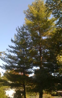
Two trees in our drive, planted at the same time. (Note the difference in size of trunk)
I mention this series of events since it helps illustrate a very significant problem that appears to have arisen over the credibility of the data used to generate many of the curves predicting serious global warming over the next century. In order to determine temperature over the past thousand years climate scientists have relied on the quality of the rings laid down within the tree structure each year, with the assumption that, among other things, the local temperature controls the quality of the tree ring for that year. However, if the tree on the right in my driveway had been cored to look at its rings, then it would have shown a significant uptick in growth when the competing tree beside it died. It would now get more light and nutrition, and as a result may very well exhibit a growth rate that produced successive ring widths that went like this (units are 0.01 mm):
200; 350; 240; 210; 280; 350; 280; 390; 610; 740; 970
This would be in marked contrast to the poor tree sitting in its shadow, which remains shaded and does not increase the tree ring widths at all. Then consider that the first tree, because of all the extra sunlight and nutrition grows increasingly faster than the other tree, so that it now protrudes considerably above it and the surrounding canopy of trees (as you can see in the photo which I took in the last hour). It therefore in the more recent stages of its life (it is now around 40 years old) gets sunlight over a longer time period each day, and so its ring widths may go up even more markedly perhaps to:
710: 840; 900; 1090; 1220; 1600; 2020; 1150; 1020; 1920; 2120; 2500
These patterns of differential growth are, according to those who know forestry ( here and here) to be expected for individual trees in the forest, when local neighbors die, allowing both additional exposure to sunlight from the survivor, and also some additional nutrient from the corpse of the victim.
What makes this particularly germane at the moment is that such a tree record turns out to have played a very significant part in the development of the “hockey stick” curve that was made so much of in the 2004 IPCC report, and in subsequent reconstructions of temperatures over the past miilennium.
The numbers that I quoted above actually came from a tree that was found in the Yamal Peninsula (yes the home of much of Russia's future production of oil and gas) is known as YAD06 and its record was used by Keith Briffa in determining the rise in temperatures over the past century. If you look at the data for that tree, you can see (with the vertical scale normalized) that it shows a very strong increase in ring sizes since 1900.
Yamal tree ring growth (after Steve McIntyre)
Now one tree, obviously doesn’t create a viable record on its own, and in the original work Briffa and co-authors had used a dozen trees to generate the trend. And, when the data from them is examined, it does appear (although our tree is much more sensitive than the others) that there is some form of trend in the data.
Tree ring (and hence temperature) data for the 12 trees used by Briffa as a foundation to Mann’s hockey stick curve. (Source after Steve McIntyre)
However, what has not been clear until this week (there is a long story of efforts to block publication of the information which has been described by Bishop Hill and Ross McKitrick) is that there was a significantly larger body of data from which the above 12 tree chronologies were selected. When that larger body of data is examined it turns out that the trees that were not selected (of which there were a greater number) did not show this upward trend.
Tree ring (and hence temperature) measurements after being normalized, that were not included in the Briffa choice for his paper. (after Steve McIntyre)
It might be surmised after looking at this comparison that it would be more appropriate to use a more average value for the data from the region, rather than the smaller data set with the peculiarity of including our friendly example tree. But when one does that then hockey stick disappears. Briffa’s data was used extensively by other climate scientists in the past decade, and one might have thought that there would be some concern now that there is question on the validity of the underlying information used by the community.
Unfortunately the response to date at Real Climate seems to indicate, as has become increasingly obvious, that this is not about a search for truth, but rather part of the propaganda play in a political struggle. It is a curious statement that spends its time excoriating those that note the differences between the data selected and that admitted, rather than the meaning of the wider data set to the interpretation of how climate is changing. (I am however amused to see that we do see some evidence of a Medieval Warming Period now beginning to creep back into their posts).
Sadly I don't think that this is going to change the climate debate at all. Papers such as the Guardian are apparently blocking all attempts to blog about the topic on their Website (and a Google search of their site showed no hits) . and I imagine that the hope of the alarmists is that it will just go away. And in about a year they will come back with a "oh, yes we addressed that issue at the time" - citing their current post - and refuse to debate it further. It has worked for them before.
I mention this series of events since it helps illustrate a very significant problem that appears to have arisen over the credibility of the data used to generate many of the curves predicting serious global warming over the next century. In order to determine temperature over the past thousand years climate scientists have relied on the quality of the rings laid down within the tree structure each year, with the assumption that, among other things, the local temperature controls the quality of the tree ring for that year. However, if the tree on the right in my driveway had been cored to look at its rings, then it would have shown a significant uptick in growth when the competing tree beside it died. It would now get more light and nutrition, and as a result may very well exhibit a growth rate that produced successive ring widths that went like this (units are 0.01 mm):
200; 350; 240; 210; 280; 350; 280; 390; 610; 740; 970
This would be in marked contrast to the poor tree sitting in its shadow, which remains shaded and does not increase the tree ring widths at all. Then consider that the first tree, because of all the extra sunlight and nutrition grows increasingly faster than the other tree, so that it now protrudes considerably above it and the surrounding canopy of trees (as you can see in the photo which I took in the last hour). It therefore in the more recent stages of its life (it is now around 40 years old) gets sunlight over a longer time period each day, and so its ring widths may go up even more markedly perhaps to:
710: 840; 900; 1090; 1220; 1600; 2020; 1150; 1020; 1920; 2120; 2500
These patterns of differential growth are, according to those who know forestry ( here and here) to be expected for individual trees in the forest, when local neighbors die, allowing both additional exposure to sunlight from the survivor, and also some additional nutrient from the corpse of the victim.
What makes this particularly germane at the moment is that such a tree record turns out to have played a very significant part in the development of the “hockey stick” curve that was made so much of in the 2004 IPCC report, and in subsequent reconstructions of temperatures over the past miilennium.
The numbers that I quoted above actually came from a tree that was found in the Yamal Peninsula (yes the home of much of Russia's future production of oil and gas) is known as YAD06 and its record was used by Keith Briffa in determining the rise in temperatures over the past century. If you look at the data for that tree, you can see (with the vertical scale normalized) that it shows a very strong increase in ring sizes since 1900.
Yamal tree ring growth (after Steve McIntyre) Now one tree, obviously doesn’t create a viable record on its own, and in the original work Briffa and co-authors had used a dozen trees to generate the trend. And, when the data from them is examined, it does appear (although our tree is much more sensitive than the others) that there is some form of trend in the data.
Tree ring (and hence temperature) data for the 12 trees used by Briffa as a foundation to Mann’s hockey stick curve. (Source after Steve McIntyre) However, what has not been clear until this week (there is a long story of efforts to block publication of the information which has been described by Bishop Hill and Ross McKitrick) is that there was a significantly larger body of data from which the above 12 tree chronologies were selected. When that larger body of data is examined it turns out that the trees that were not selected (of which there were a greater number) did not show this upward trend.
Tree ring (and hence temperature) measurements after being normalized, that were not included in the Briffa choice for his paper. (after Steve McIntyre)It might be surmised after looking at this comparison that it would be more appropriate to use a more average value for the data from the region, rather than the smaller data set with the peculiarity of including our friendly example tree. But when one does that then hockey stick disappears. Briffa’s data was used extensively by other climate scientists in the past decade, and one might have thought that there would be some concern now that there is question on the validity of the underlying information used by the community.
Unfortunately the response to date at Real Climate seems to indicate, as has become increasingly obvious, that this is not about a search for truth, but rather part of the propaganda play in a political struggle. It is a curious statement that spends its time excoriating those that note the differences between the data selected and that admitted, rather than the meaning of the wider data set to the interpretation of how climate is changing. (I am however amused to see that we do see some evidence of a Medieval Warming Period now beginning to creep back into their posts).
Sadly I don't think that this is going to change the climate debate at all. Papers such as the Guardian are apparently blocking all attempts to blog about the topic on their Website (and a Google search of their site showed no hits) . and I imagine that the hope of the alarmists is that it will just go away. And in about a year they will come back with a "oh, yes we addressed that issue at the time" - citing their current post - and refuse to debate it further. It has worked for them before.
Read more!
Labels:
Briffa,
Climate Audit,
MWP,
Real Climate,
Steve McIntyre,
tree rings,
Yamal
Saturday, February 21, 2009
Honesty in Climate Reporting and Discussion
I am a fan of Edward Tufte’s work. For most of you I suspect that will inspire nothing more than a Huh? But I want to use an example from the global warming debate to show how, by manipulating graphics, you can sell opposing messages with the same set of data. It is this subject (that of graphic manipulation) and the need for honesty in data presentation, about which I feel rather strongly as an academic, that has made me a fan of Edward’s writing.
At the urging of the Advocate, I am going to use a post by Nate Silver (my turn for a Huh?) as my example, and will compare his selected use of segments with, an overall temperature plot from the British Climate Research Unit at Hadley (HadCRU) and with a plot from the Goddard Institute for Space Studies (GISS) in New York., which James Hansen heads. The initial period I am going to look at is from 1940 to 1975. This is the period that initially George Will wrote about, commenting that, in 1975, scientists were looking at the trends and he quoted nine articles from that time with discussions on this trend. So does our friendly critic look at that time period in his commentary – er, well, not exactly!. Here is the GISS plot for about that period:
Source GISS
and this is the more simplified segment of the HadCRU plot.
Source Hadley Climate Research Unit
They’re both small segment of larger plots I will get to in just a minute. And if you look at both you can see (you don’t have to be a rocket scientist) that the trend is down. That was what the scientists were talking about in 1975. So is that what our good friend showed – of course not that wouldn’t allow him to make his point, so he expanded the range, backwards from 1940, into the previous segment of time, including enough points to suggest that the overall plot was upwards (and ergo all those scientists, not to mention George Will, were idiots).
Source FiveThirtyEight
Now you should be able to see that if you knock the data off from before 1940, you will see the same trend as in the earlier graphs.
Now the next bit is a little more interesting, because he pulls back to show that there was a warming trend before 1940, and takes the curve back to about 1860, and, depending on where you define the end points he puts a single warming trend line through the data.

That simplifies what actually went on, looking at both the GISS plot and then HadCRU:
SOURCE GISS
And for the simpler HadCRU

You can see that the way in which the temperature was behaving was not quite the simple plot that has been suggested, but that it fluctuates up and down, and if we break the HadCRU plot into roughly 30-year bits, you can see it drops 1880-1910, then goes up, 1910-1940, then drops 1940 – 1970. So it was really not that easy, back in 1975, to decide where the temperature would go next.
Where it went is now well-publicized, and I will put all three plots up here in full for the next bit.
First the Silver plot:
Source FiveThirtyEight
Now the GISS plot:

and then the HadCRU plot (I showed their entire illustration, lest I be accused of cropping anything):

There are a couple of interesting things to the shape of the lower two curves, that are not clear if you just draw the simple line, that Mr Silver uses, through the data. The first is that it warmed about as much from 1910 to 1940 as it did from 1970 to 2000, in other words the rate of warming was about the same. Not much attention is usually paid to this part of the warming trend – well that is because of this other graph, which is the one that usually gets all the attention.
Source White House Initiative on Climate Change
Now we will forgo for now the discussion about measuring carbon dioxide over an active volcano but you will notice the different slopes for the curve back in the 1910 – 1940 period where we were getting the same rate as we have just recently – curious scientists want to know why? But actually, and more to the point, that graph is a very smooth curve from 1860, as you may note the real temperature data is not.
There are two final points to consider. The first is why I put up the HadCRU and the GISS plots. You may note that at the end of the HadCRU data the curve turns over and starts to go back down. That’s what the data shows. But the GISS plot does not carry the plot that far down. In fact earlier plots of data that just showed the last ten years of data (with 1998 at the peak) disappeared from the GISS site about the end of last year. The differences between the interpretations, and the fact that recent data (in the HadCRU form) does not allow the hysteria about the imminence of doom that comes from the GISS Head, is perhaps why Hadley are now starting utter some words of caution about this whole debate, and that we cannot make misleading claims.
I am going to close with a plot from the 1995 IPCC report that does not get a lot of attention these days, but might explain why the leveling off in global temperature is happening:
Source IPCC 1995 full report
I have written earlier about the Little Ice Age, and will again, and on not only the last warming period, but also the ones before it, for which there is much evidence. It turns out not to be as simple a temperature plot as the IPCC summarized in that plot, but the realities of this cyclic nature of global climate are recorded, not only in books and manuscript, but in archaeological sites, and beneath our feet.
So let's stop with the insults (if you attack a person rather than their science, it concedes the point that their science is stronger than yours) and discuss the volumes of real scientific data that make exactly where we are in the progress of global warming a whole lot more of a question that many people would like you to think.
.
At the urging of the Advocate, I am going to use a post by Nate Silver (my turn for a Huh?) as my example, and will compare his selected use of segments with, an overall temperature plot from the British Climate Research Unit at Hadley (HadCRU) and with a plot from the Goddard Institute for Space Studies (GISS) in New York., which James Hansen heads. The initial period I am going to look at is from 1940 to 1975. This is the period that initially George Will wrote about, commenting that, in 1975, scientists were looking at the trends and he quoted nine articles from that time with discussions on this trend. So does our friendly critic look at that time period in his commentary – er, well, not exactly!. Here is the GISS plot for about that period:
Source GISS and this is the more simplified segment of the HadCRU plot.
Source Hadley Climate Research Unit They’re both small segment of larger plots I will get to in just a minute. And if you look at both you can see (you don’t have to be a rocket scientist) that the trend is down. That was what the scientists were talking about in 1975. So is that what our good friend showed – of course not that wouldn’t allow him to make his point, so he expanded the range, backwards from 1940, into the previous segment of time, including enough points to suggest that the overall plot was upwards (and ergo all those scientists, not to mention George Will, were idiots).
Source FiveThirtyEightNow you should be able to see that if you knock the data off from before 1940, you will see the same trend as in the earlier graphs.
Now the next bit is a little more interesting, because he pulls back to show that there was a warming trend before 1940, and takes the curve back to about 1860, and, depending on where you define the end points he puts a single warming trend line through the data.

That simplifies what actually went on, looking at both the GISS plot and then HadCRU:
And for the simpler HadCRU
You can see that the way in which the temperature was behaving was not quite the simple plot that has been suggested, but that it fluctuates up and down, and if we break the HadCRU plot into roughly 30-year bits, you can see it drops 1880-1910, then goes up, 1910-1940, then drops 1940 – 1970. So it was really not that easy, back in 1975, to decide where the temperature would go next.
Where it went is now well-publicized, and I will put all three plots up here in full for the next bit.
First the Silver plot:
Source FiveThirtyEight Now the GISS plot:

and then the HadCRU plot (I showed their entire illustration, lest I be accused of cropping anything):

There are a couple of interesting things to the shape of the lower two curves, that are not clear if you just draw the simple line, that Mr Silver uses, through the data. The first is that it warmed about as much from 1910 to 1940 as it did from 1970 to 2000, in other words the rate of warming was about the same. Not much attention is usually paid to this part of the warming trend – well that is because of this other graph, which is the one that usually gets all the attention.
Source White House Initiative on Climate Change Now we will forgo for now the discussion about measuring carbon dioxide over an active volcano but you will notice the different slopes for the curve back in the 1910 – 1940 period where we were getting the same rate as we have just recently – curious scientists want to know why? But actually, and more to the point, that graph is a very smooth curve from 1860, as you may note the real temperature data is not.
There are two final points to consider. The first is why I put up the HadCRU and the GISS plots. You may note that at the end of the HadCRU data the curve turns over and starts to go back down. That’s what the data shows. But the GISS plot does not carry the plot that far down. In fact earlier plots of data that just showed the last ten years of data (with 1998 at the peak) disappeared from the GISS site about the end of last year. The differences between the interpretations, and the fact that recent data (in the HadCRU form) does not allow the hysteria about the imminence of doom that comes from the GISS Head, is perhaps why Hadley are now starting utter some words of caution about this whole debate, and that we cannot make misleading claims.
I am going to close with a plot from the 1995 IPCC report that does not get a lot of attention these days, but might explain why the leveling off in global temperature is happening:
Source IPCC 1995 full reportI have written earlier about the Little Ice Age, and will again, and on not only the last warming period, but also the ones before it, for which there is much evidence. It turns out not to be as simple a temperature plot as the IPCC summarized in that plot, but the realities of this cyclic nature of global climate are recorded, not only in books and manuscript, but in archaeological sites, and beneath our feet.
So let's stop with the insults (if you attack a person rather than their science, it concedes the point that their science is stronger than yours) and discuss the volumes of real scientific data that make exactly where we are in the progress of global warming a whole lot more of a question that many people would like you to think.
.
Read more!
Sunday, February 8, 2009
Advancing and Retreating Glaciers in the Holocene
I was musing as to how to start this post, and so I Googled “Medieval Warming Period”, and found that there is a post at Gristmill about talking to an AGW sceptic, that states
I am going to be quoting from Jean Grove’s “Little Ice Ages – Ancient and Modern” again in this post, but from volume 2 this time. As with the first volume the book is copiously referenced with detailed scientific studies, the Bibliography runs 70 pages of 2-columns, with about 16 references/column/page, which works out to over 2,000 references on the subject. The subject is as the title says it is, the ice ages of the past millennia, with evidence of their extent and intensity, and their global nature. Between the periods of increased cold, there are periods where it is warmer, even than today. These also are documented, with evidence. The evidence is debated, and weighed as to credibility. It does not require a proxy to show that where a farm existed and there is now ice, that it was warmer when the farm was there than it is now, as an example, or when the advance of a glacier sheared off the trees, to surmise that it was getting colder.
The scope of the work, and recognize that this is a summation of the work of the hundreds of scientists writing the papers that she has combined and integrated, covers largely the advance and retreat of glaciers. In the first volume, which I covered earlier, the main focus was on looking at the last Little Ice Age, and its global impact with glaciers from Alaska to New Zealand growing to new lengths, and then in the early 1800’s starting to contract.
In the second volume the emphasis switches to the Holocene as a whole, namely roughly the past 10,000 years. And, while glacier advance and retreat cannot by itself be taken as a sole indicator of global temperature, some of the concurrent events (the rise and fall of the tree line in the region surrounding the glaciers, and the formation of lakes or peat bogs where glaciers stood, for example) serve as proxy thermometers. As an example, writing about the Engebreen and the main Svartisen glacier
I have used Greenland as an example of historic climate change in the past, and it is interesting to quote
Retreat of the Jakobshavn glacier
The book continues, going from ice field to ice field as it moves from the Arctic to the Antarctic. Then it plots a curve showing the coincidence of the periods of glacial advance around the world, over the Holocene. Obviously in some parts the work has yet to be done to fully define the periods and details of the glacier movements. Yet the one thing that stands out is that over the past 3,000 years there has been a remarkable consistency in the periods, around the world, when glaciers advanced, and when in the presence of a warming period they retreated.
Regional summaries of glacier expansion (Grove Fig. 15.25)
The book notes the existence of the Dansgaard-Oeschger cycles
Well, as you can see, the real story is quite different to that which Gristmill would have you believe. Sadly at present there are just not that many folk that will question the statements that they blandly make. I will add the correlative plot from the book in the morning (or rather later in the morning).
Addenda The graphic is added above - fig 15.25.
.
There is no good evidence that the MWP was a globally warm period comparable to today. Regionally, there may have been places that exhibited notable warmth -- Europe, for example -- but all global proxy reconstructions agree it is warmer now, and the temperature is rising faster now, than at any time in the last one or even two thousand years.This is actually a set of incorrect statements. And it epitomizes one of the problems facing those of us that would prefer to have this as a scientific debate about the facts. The problem is the blanket refusal of those who consider that greenhouse gases are the cause of global warming to recognize the considerable body of scientific evidence that contradicts their case.
I am going to be quoting from Jean Grove’s “Little Ice Ages – Ancient and Modern” again in this post, but from volume 2 this time. As with the first volume the book is copiously referenced with detailed scientific studies, the Bibliography runs 70 pages of 2-columns, with about 16 references/column/page, which works out to over 2,000 references on the subject. The subject is as the title says it is, the ice ages of the past millennia, with evidence of their extent and intensity, and their global nature. Between the periods of increased cold, there are periods where it is warmer, even than today. These also are documented, with evidence. The evidence is debated, and weighed as to credibility. It does not require a proxy to show that where a farm existed and there is now ice, that it was warmer when the farm was there than it is now, as an example, or when the advance of a glacier sheared off the trees, to surmise that it was getting colder.
The scope of the work, and recognize that this is a summation of the work of the hundreds of scientists writing the papers that she has combined and integrated, covers largely the advance and retreat of glaciers. In the first volume, which I covered earlier, the main focus was on looking at the last Little Ice Age, and its global impact with glaciers from Alaska to New Zealand growing to new lengths, and then in the early 1800’s starting to contract.
In the second volume the emphasis switches to the Holocene as a whole, namely roughly the past 10,000 years. And, while glacier advance and retreat cannot by itself be taken as a sole indicator of global temperature, some of the concurrent events (the rise and fall of the tree line in the region surrounding the glaciers, and the formation of lakes or peat bogs where glaciers stood, for example) serve as proxy thermometers. As an example, writing about the Engebreen and the main Svartisen glacier
A warm period about 1500 BP (before present) (cal AD 500) is recorded by the growth of pine forest above the present pine limit. Then came ice advances marked by sheared off trees in the period AD 360 -900 (Worsley & Alexander 1975). Although the exact years in which these trees were killed has not been identified by comparing their ring sequences with the long dendrochronological series now available, their radiocarbon dates can be taken as more precise than those derived from soil and peat samples. They demonstrate that Engabreen advanced and retreated several times in this period to form a complex moraine. Karlen (1991) pointed out that the tree ring sequence indicates several temperature fluctuations with cold summers around 550 AD, and again between 780 and 970 AD, though with 20-30 years of summer warmth around AD 930.In such a manner and going from country to country is the evidence amassed. Karlen, for example, shows that the altitude of pine forests were 100 m above the current limit in the Medieval Warming Period around 1,000 years ago, and that the height of the tree line had varied up and down over 200 m in the Holocene. He concluded that this represented a change of about 1.5 degC.
I have used Greenland as an example of historic climate change in the past, and it is interesting to quote
By about 6,000 calBP the inland ice margin had retreated to a position close to the present (Weidick et al 1990) . . . .Retreat of the ice continued and from at least 4700 to 2700 calPB the inland ice margin was inland of its present position by as much as 15 km. The scale of the retreat is indicated b subfossil shells, reindeer bones and a walrus tusk, brought to the surface by the ice of Jakobshavn Isbrae and deposited in moraines. The reindeer bones which have been dated to 3040 +/- 60 BP must have come from above the snow line over 50 km from the ice margin, and moved westwards in the ice at a rate of about 20 -50 m per year.The front recession has been plotted over the past 150 years, and is shown here.
The mean annual temperature at Jakobshavn on Disco Bay in the Holocene Climatic otimum is estimated have been about -1 degC, as opposed to -3 degC currently. The great fjord stretching 60 km to the east where the tongue of Jakobshavn Isbrae is now more than 700 m thick, was then free of ice. With readvances probably around 2500 and 1200 BP the ice haltingly returned. Finally, between 1850 and 1880, the Little Ice Age advance culminated, since when the ice has continuously thinned (Weidick 1996).
Retreat of the Jakobshavn glacierThe book continues, going from ice field to ice field as it moves from the Arctic to the Antarctic. Then it plots a curve showing the coincidence of the periods of glacial advance around the world, over the Holocene. Obviously in some parts the work has yet to be done to fully define the periods and details of the glacier movements. Yet the one thing that stands out is that over the past 3,000 years there has been a remarkable consistency in the periods, around the world, when glaciers advanced, and when in the presence of a warming period they retreated.
Regional summaries of glacier expansion (Grove Fig. 15.25)The book notes the existence of the Dansgaard-Oeschger cycles
The Dansgaard-Oeschger cycles turn out to he bundled into longer cooling cylces, each of which ends with an abrupt shift from cold to warm temperatures. These bundles are known as Bond cycles. It appears that during the abrupt cold-to-warm shifts at the end of Bond cycles temperatures must have changed by several degrees within a matter of decades, both at the ocean surface, and in the atmosphere over Greenland.Though not understood, the book suggests that the climate change may have been induced by changes in atmospheric dust.
Well, as you can see, the real story is quite different to that which Gristmill would have you believe. Sadly at present there are just not that many folk that will question the statements that they blandly make. I will add the correlative plot from the book in the morning (or rather later in the morning).
Addenda The graphic is added above - fig 15.25.
.
Read more!
Subscribe to:
Posts (Atom)


