Showing posts with label USHCN. Show all posts

Tuesday, December 4, 2012

Gentle Cough - The Post Dispatch and Cherry-picking data

It has been a little while since I wrote anything about the Global Warming situation. Not that there is not an ongoing series of messages about how we are going to be drowned by increased glacial melting, or that extreme events might become more prevalent, and that we need to take precautions in case they do. Of course there is not a lot of evidence that the rate of extreme event occurrences has been increasing, but the alarmists feel that there is some need to drive home the message that the world has to be concerned about Global Warming, even when the globe isn’t warming. And so this post, which first notes why I wrote the last sentence, and then comments on how the media message is changing so that, by cherry picking data, alarm can still be spread.

So first let us look at the Global Warming situation. It has received very little coverage in the United States, and barely rated a mention in the UK, but the recent release of a new plot of global temperatures by the Climate Research Unit (CRU) at the University of East Anglia (UEA) is worth putting up, purely as a matter of record.


Figure 1. Global average temperatures over the past 15 years (British Daily Mail ).

This Met Office release (on a Friday) has largely been ignored by a scientific community that only exists in its current form as long as the reality that this graph presents remains ignored.

There was an immediate controversy in the UK (but not here, where it remains largely unknown) and there was a follow up report the following Sunday. But, even while ignored, the lack of increase in global temperature over the past fifteen years is surely some indication that the models widely used to predict an exponentially increasing global temperature, are falsified.

So what can a good alarmist do? Well consider the headline in the St. Louis Post Dispatch on November 26th. “2012 so far the warmest year on record in parts of Missouri.” So let me talk about this for a minute.

Notice that this does not say that the entire state is at its warmest. Rather it reports that Jayson Gosselin of the National Weather Service has noted that this was the warmest year on record for St. Louis and Columbia.
The average temperature in St. Louis so far this year is 63.4 degrees, a full degree higher than the 62.4-degree average seen in the previous warmest year, 1921. In Columbia, the previous warmest year as of Nov. 24 was in 1938, when the average was 61 degrees. This year, the average is 61.7 degrees. In Kansas City, Mo., it has been the fourth warmest year on record so far, with an average temperature of 61.3 degrees, Gosselin said.
He goes on to be more specific about when the heat wave occurred (in case we missed it!)
Gosselin, who works in the Weather Service's office near St. Louis, said the "meteorological spring" _ March through May _ was far and away the warmest ever in St. Louis with an average temperature of 61.1 degrees. Second warmest was 1910, when the average was 57.5 for the spring months. Summer also was unusually warm. Average temperatures in March, May and July all set records in St. Louis, he said.
For those who forget, I took a look at the Missouri State Temperatures first back in February 2010, when I first became curious as to whether our state was showing the global warming that everyone was talking about.

I found the location of all the US Historical Climate Network sites for Missouri and determined their location (latitude and longitude) elevation and population. Now as it turns out that there are 26 stations in Missouri, and so I took the average temperature for each station each year (this was the “homogenized” temperature in that initial post) and was able to plot the average state temperature over time.


Figure 2. Average “USHCN homogenized” temperatures for the state of Missouri (USHCN)

And if you look at that plot the state temperature has barely risen (less than half a degree Fahrenheit in 115 years) since official temperatures have been recorded, and the hottest years were in the 1930’s in the dust bowl years.

But there was something missing from the data table and it turns out that three of the largest cities in the state, Columbia, Springfield, and St. Louis were not tabulated in this network, but are, instead, part of the Goddard Institute for Space Studies (GISS) network that Dr. James Hansen used for his work.

And, being further curious, I then combined the two sets of data and obtained a plot for temperature as a function of population.


Figure 3. Temperature as a function of population size around the station. This conclusion, that there is a log relationship is not new. To quote from that post:
Oke (1973) * found that the urban heat-island (in °C) increases according to the formula –

➢ Urban heat-island warming = 0.317 ln P, where P = population.

Thus a village with a population of 10 has a warm bias of 0.73°C. A village with 100 has a warm bias of 1.46°C and a town with a population of 1000 people has a warm bias of 2.2°C. A large city with a million people has a warm bias of 4.4°C.
It is interesting to note that his coefficient is 0.317 and the one I found is 0.396.

( * Oke, T.R. 1973. City size and the urban heat island. Atmospheric Environment 7: 769-779.)

But then I revisited the state later in time, after the USHCN started also providing the raw and Time of Observation Corrected data (TOBS). And I found a few more interesting facts.

Firstly I compared the difference between the GISS data for the three large cities with the state average temperatures for both the raw data, and the “homogenized” data.


Figure 4. Difference between the average temperature in the large cities, and that of the average temperature in the State. The blue line is for the homogenized data, the red is for the raw.

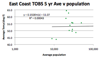
I then went on to compare the TOBS average to that of the largest cities and this is what I got:


Figure 5. Difference between the average temperature in the large cities of the state, and that of the average temperature in the state using the TOBS data.

A slight upward trend, but not that significant. As for the temperatures in Missouri, over the past 100 years, with the correction – really there is no trend, it has been relatively stable:


Figure 6. Average TOBS temperature for the state of Missouri over the recorded interval.

I did note that the highest temperatures were some decades ago.

Oh and the correlation with population held up with the TOBS data, the coefficient was 0.327, and the r^2 value was 0.14.

Now I finished the entire contiguous United States some time ago, and that temperature relationship to population held up quite well, as the individual state reports listed on the rhs side of the blog show.

So what do we learn from this? That alarmist rhetoric is continuing with an embarrassing lack (for those of us who are scientists) of balance in the reporting. Data now has to be carefully cherry-picked to still be able to convey the message that the world is warming. One wonders how long they will be able to get away with this before they are called out by more prominent folk?

Read more!

Sunday, September 18, 2011

Temperatures in the Flat Middle of the USA

Last week I noted the curious drop in temperature along the Eastern Seaboard in the period from around 1950 to 1965. The question then arises as to whether there are other pieces of information in the data that I have accumulated, and so, out of curiosity, today I will look at the strip of states in the middle of the country and compare their average temperature with that of the East Coast. (Checking to see if my memory that there wasn't quite the same drop is, in fact, true).

I am trying to stay away from mountains in this strip, so I will pick Minnesota, Wisconsin, Michigan, Iowa, Illinois, Indiana, Kansas, Missouri, Oklahoma, Arkansas, Texas, Louisiana, Mississippi, and Alabama. And, while there are some hills in the selection, just for simple characterization I am going to call these the “Flat Mid States.”

Interestingly all these months since I first looked at Arkansas, there is still a problem downloading the data for Rohwer from the USHCN, so I used the GISS values instead (recognizing that they are a little manipulated, but since I am averaging over 15 stations, reckoning that the “adjustment” won’t make that much difference.)

Looking at the average plot just averaging the state average values, calculated in earlier posts, one gets, for the homogenized data:

Averaged temperature in the Mid States using state average homogenized temperatures

When one uses the TOBS data, rather than the homogenized values, then the curve changes to

Averaged temperature in the Mid States using state average TOBS temperatures

If I weigh the results by the stations in the state (there are a total of 405 stations in this series), then the result, using TOBS data becomes:

Averaged temperature in the Mid States using state average TOBS temperatures, weighted by number of stations

The effective result of the weighting in the above plot is just to average all the station data. When, however, the area of the states is considered, bearing in mind that apart from Texas they are all much the same size, then the result becomes:

Averaged temperature in the Mid States using state average TOBS temperatures, weighted by state area.

It should be noted that the trend over the range of data is sensibly zero, i.e. there has been no temperature increase on average for these states, over the past 110 years.

The drop in temperature, so clear in the data for the Atlantic States is not as prolonged here, falling from 57.9 deg F in 1954 to 55.1 deg in 1960. Comparing the two plots:

Average temperature in the Flat Mid states (upper green) , relative to those of the Atlantic Shore states (lower red), averaging states weighted by area.

Note that there is a definite rise in temperature along the sea siding states. Also the larger size of Texas tends to give a larger weight to the south here, and thus the overall higher average.

Looking at the individual trends for each state in this set, I have again divided it into two sets to make it easier to distinguish the individual lines.

Average temperatures for the Northern set of states in the Flat Mid region

Note that Wisconsin and Michigan virtually overlap.

Average temperatures for the Southern set of states in the Flat Mid region
Here it is Arkansas and Oklahoma that are almost superimposed.

I will go on to look at other regions and compare them to see how temperature averages differ around the country, but will leave you with the usual comparison.

Difference between the average value for the USHCN homogenized values after the original TOBS values have been subtracted.

Read more!

Saturday, September 10, 2011

The Four degree temperature drop along the Atlantic Seaboard

During the time that I was acquiring the data for the different USHCN stations around the country (the list for which is down on the right-hand side of the column) I found that there seemed to be a consistent drop in temperature along the East Coast of the United States that wasn’t seen in other states. So today I thought I would consolidate a few graphs from that series and see if my week-to-week observations were as consistent as they seemed at the time. The time period that I am looking at is in the 1948 to 1965 time frame, and you can see the drop in temperatures that I am referring to most clearly and as an illustrative example, using the average of the three GISS stations in Georgia. You may note that the temperature drop was over 4 deg F in that time period , peaking at 65.4 deg in 1949, and falling to 61.2 deg F in 1967. (There was a temperature of 65.1 deg in 1957).

Average temperature with time for the three GISS stations in Georgia

I have, in the state temperature series, compared the GISS temperatures reported for each state (blue lines) with the USHCN average temperatures, both using the homogenized data where NOAA has interpolated results to infill missing and “errant” values (the purple data lines), and with the original temperatures recorded, corrected only for the time of observation (the TOBS series, which are shown with a green line).

The series established that there was a change in temperature with latitude, with elevation and with population, and I recognize that all states differ in all three variables, as well as in their area. In time I will, hopefully, get around to discussing those findings in more detail, but this exercise is more just to look at that fall in temperature in the 1947 – 67 time frame. Inserting the individual average temperature data for each of the states that border the Atlantic, but discounting Florida because of the possible influence of the Gulf, the list includes fourteen states:- Georgia, South Carolina, North Carolina, Virginia, Maryland, Delaware, Pennsylvania, New Jersey, New York, Connecticut, Rhode Island, Massachusetts, New Hampshire and Maine.

ADDENDUM: I had initially not included the individual state plots over the time in question, I have now added those plots (combined on two graphs) at the end of the post.

By just taking the average temperature I had calculated for each state, and then averaging those each year, using the USHCN homogenized data I get this plot:

Average temperature with time for the USHCN stations along the East Coast, averaged by state and then collectively, using homogenized data.

If one uses the TOBS data rather than the homogenized version, then the plot becomes:

Average temperature with time for the USHCN stations along the East Coast, averaged by state and then collectively, using TOBS data.

In both of the above plots the fall in temperature between the 54.3 deg F temperature in 1949 and the 50.9 deg F temperature in 1967 (TOBS temps) is clear.

The problem with doing that simple average, however, is that not all states are equal. Of the 250 station total, some states have only 3, and others as many as 57, but I have used a single average for each state. And the reason in part for the different number of stations is that the areas of the states are different, ranging from roughly 1,000 sq miles to almost 60,000 sq miles. As a result the area that a station covers ranges from roughly 300 sq miles to 2,500 sq miles. The area of each state was obtained from the netstate site for each of the states.

Does it make a difference, well, using the TOBS data as an example, and weighting first by the number of stations in the state, the curve changes to:

Average East Coast Temperatures with state averages weighted by station density in the state.

The alternative is to weight the average in terms of the area of each state, and when one does this, then the plot changes to:

Average East Coast Temperatures with state averages weighted by the area of the state.

If one looks at the change in plot through doing the weighting (and the areal plot seems to be the more logical) it is clear that the shape of the graph changes, particularly after 1960, and further that if one looks at the rate of temperature increase this also falls.

When the original USHCN homogenized data plot, just averaging the state temperatures is used, then the rate of temperature increase is 1.67 deg F per century. If that data is weighted by station density (which turns out to mean just averaging all 250 station data) then the homogenized rise falls to 1.24 deg F per century, and if the state average data is weighted by the state area when calculating the average then the temperature rise falls to 1 degree per century.

If the TOBS raw data is used instead of the homogenized values then just averaging the state values gives a temperature rise of 0.8 deg F per century, while taking the station density into consideration lowers that to 0.56 deg F per century, and when the state values are averaged based on the individual state areas, then the temperature rise over the century falls to 0.3 deg F.

None of this tells us why the temperature fell so dramatically along the East Coast in the 1949-1963 time frame – the area weighted TOBS data suggests that the fall was from 56.1 deg F in 1949 to 52.5 deg F in 1963, it would be interesting to find out why.

Looking at the other possible trends in the data, plotting the average state temperature against latitude

Correlation of average state temperature with latitude along the East Coast

There does not appear to be much correlation with elevation:

Correlation of average state temperature with elevation along the East Coast

Nor, and both of these may be caused by a fault of the way in which I have calculated averages, is there a correlation with population.

Correlation of average state temperature with local station population average along the East Coast

Well the it seems pretty clear that there was indeed, along the East Coast from Georgia to Maine, a fall in temperature of 3.6 degrees from 1949 to 1963. I don’t remember seeing such a drop in other regions of the country, but I suppose I had better check those out next.

Oh and the difference between the USHCN homogenized curve and the TOBS data is interesting (I used the areal weighted average values).

Correction applied by NOAA to the original TOBS data for stations along the East Coast, bear in mind that this is averaged over a total of 250 stations.

Addendum
I stated at the beginning that I was checking that the drop held true for all states, but actually just summarized them without showing the individual state values imposed on one another. My apologies, and because there are 14 states I have broken the plots down into two parts, first the more southerly states:

Variation in average state temperature in the period 1940 to 1980 for the Southern half of the Eastern Seaboard states

Variation in average state temperature in the period 1940 to 1980 for the Northern half of the Eastern Seaboard states

The temperature drop between roughly 1950 and 1965 can be seen in each plot, validating the opening thought, but since the lower curves reflect a more northern position, it is worthy of note that the drop seems to move to the right over time, and the variation gets more jagged as one moves north.

Yet more questions!!

Read more!

Saturday, August 20, 2011

New Jersey combined temperatures

Crossing from Delaware into New Jersey as I come toward the end of the data acquisition part of the project I started last year looking at state temperatures over the past one hundred and fifteen years, I find that New Jersey has a dozen USHCN stations.

Location of the USHCN stations in New Jersey (CDIAC ).

According to the list, the only GISS station in the state is in Atlantic City. There have been 3 stations there, one that ran from 1895 to 2008, down at the Marina. This clearly shows the drop in temperature in the 1948 – 1965 period that I have been mentioning in the last few posts on the subject.

Longer term temperature profile reported for the GISS station in Atlantic City (GISS ).

However, as has become evident in many states that I have reviewed, the one that is being used by GISS has a much more recent history, only having been in operation since 1951.

That record also clearly shows the temperature drop, though with the start in 1951, it is not as clear that this is an anomaly from the overall rising trend.

Reported temperatures for the GISS station currently being used in Atlantic City (GISS ).

Given the steady rise in temperature of the station at the Marina, I was curious to see how far from the sea the new station is. It turns out to be at the airport, which is 9 miles from the sea, and 23 m above sea level.

Location for the current GISS station in Atlantic City, New Jersey.(Google Earth)

And then as I start to import the data for the USHCN stations, I find that the first one is still at the Atlantic City Marina:

Location of the USHCN station in Atlantic City, at the Marina (Google Earth)

New Jersey is 150 miles long and 70 miles wide, running from 73.9 deg W to 75.58 deg W, and 38.9 deg N to 41.3 deg W. The mean latitude is 40.1 deg , that if the USHCN stations is 40.3 deg N, and the GISS station is at 39.45 deg N. The elevation of the state runs from sea level to 549 m, with a mean elevation of 76.2 m. The mean USHCN station is at 53.9 m, while the GISS station is at 23 m.

Because of the short interval for which information from the current GISS station has been presented, the difference between it and the USHCN average is relatively short.

Difference between the data presented for the GISS station in New Jersey and the average of the USHCN stations

For the state itself, turning to the Time of Observation corrected (TOBS) raw data, and seeing how the temperature in the state has changed over the years:

Change in the TOBS temperatures, on average, for the USHCN stations in New Jersey.

It can be seen that there has been, with the exception of the time from about 1950 to 1965, a steady increase in temperature. As I had noted in an earlier post on Rhode Island the sea surface temperatures (SST) have risen by about 1.8 deg F per century. This is relatively close to the value shown in the above graph. (Note that the homogenized data plot shows a temperature rise of 2.45 deg F per century.)

Turning to the geographical factors, starting with latitude:

Effect of station latitude on temperature in New Jersey

Remember from previous observation that longitude is really a proxy in many cases for changes in elevation, and New Jersey is, in the main, relatively flat:

Effect of station longitude on temperature in New Jersey

There is really no significant effect of longitude, whereas when one looks at elevation:

Effect of station elevation on temperature in New Jersey

It is clear that the broadly consistent finding from other states on the role of elevation is valid also here, even with relatively smaller elevation changes.

When looking for populations, Charlotteburg has only one farm by it at the moment, but there are two sets of sub-divisions being developed in the neighborhood, which may have a significant impact on recorded temperatures in the future, though the reservoir may have a stabilizing effect.

Location of the USHCN station at Charlotteburg, NJ (Google Earth)

Indian Mills also did not come up with a citi-data site, so a check with Google Earth showed that it was close to Medford Lakes and that the station was surrounded by houses (with large lots). So I used the Medford Lakes population. Moorestown is on the edge of Philadelphia, but has a separate population,

Looking therefore at the effect of population, considering the average of the last 5 years temperatures against the local population:

Effect of local population on TOBS temperature for the USHCN stations in New Jersey.

Interestingly the homogenization of the data for the USHCN reported temperatures also creates a higher R^2 for this state.

Effect of local population on homogenized temperature for the USHCN stations in New Jersey.

Which suggests there might be some difference between the two sets of data, as there would appear to be. The recent drop is a little less than common to many earlier states.


Read more!

Saturday, August 13, 2011

Delaware combined temperatures

The last post in this series looked at the temperatures for Maryland and so, moving up along the coast, the next stop is Delaware.

Delaware USHCN stations (CDIAC)

Given the small size of the state, I thought it might also be interesting to compare the results with those for the GISS station in Washington D.C., since the latter would otherwise be left out. They are at about the same latitude, and of somewhat similar elevation, differing only in the size of their populations.

Temperatures as reported for the GISS station in Washington D.C. (GISS )

Given the built-up nature of the area around Wilmington there could be some debate as to the relative population sizes about the various stations, but for the moment I will accept the values from the citi-data sites that I have used to date. (The question is raised particularly regarding the Newark University Farm, which GISS considers to lie within metropolitan Wilmington).

It turns out that Washington is, on average, about 2.76 deg F hotter than the average for Delaware, though the difference has changed, with a steady increase until around 1980, and a fall thereafter.

Difference between the temperature reported for the GISS station at Washington DC and the USHCN average homogenized temperature for Delaware.

Looking at the overall change in temperature over time for Delaware alone, there is still that drop in temperature that occurs between around 1948 and 1965:

Average temperature for the USHCN stations in Delaware after homogenization.


Before homogenization, however, looking at the Time of Observation adjusted raw data, the trend is not as significant:

Average temperature for the USHCN stations in Delaware raw data after correction for time of observation (TOBS).

The temperature drop from around 1950 to 1965 is still present, but the overall temperature increase has fallen from 1.9 deg F per century down to 0.5 deg F per century.

Delaware is the second smallest state (after Rhode Island) and is only 100 miles long, while 30 miles wide. It stretches roughly from 75 deg W to 75.75 deg W, and from 38.5 deg N, to 39.8 deg N. The mean latitude is sensibly 39 deg N, the average of the USHCN stations is 39.3 deg N (D.C. is at 38.85). The state elevation runs from sea-level to 137 m with the mean at 18.3 m. The average of the USHCN stations is at 28.6 m.

The small number of stations makes the correlation coefficients of little real value, but they are included for consistency. It will be interesting to see how these numbers fit in when I compile the overall statistics.

Change in average station temperature in Delaware as a function of latitude.

Change in average station temperature in Delaware as a function of longitude.

Because of the relatively small change in elevation for the different stations, the correlation with elevation is not as evident here.

Change in average station temperature in Delaware as a function of elevation.

When I looked at the TOBS data available there is insufficient recent information to provide a realistic plot of temperature against local population unfortunately, but I’ll include the plot for consistency.

Change in average station temperature in Delaware as a function of population around the station.

It is clear in Delaware, as elsewhere, that the homogenization of temperature data, has led to an increase in reported temperatures with time.

Increase in temperature from the TOBS data to the reported homogenized temperatures for the stations in Delaware.

Read more!

Saturday, July 30, 2011

Virginia combined temperatures

This is a continuation of the series where I look at the temperatures recorded for an individual state, over the past 115 years, and see what that data tells us. Moving on from West Virginia which I covered last, to Virginia returns me to the Atlantic coast, and a certain curiosity as to whether the significant drop in temperatures between 1948 and 1965, found in other states further South along the coast, also occurred here. (For the impatient, it does). Virginia has 19 USHCN stations from Blacksburg to Woodstock, and has two GISS stations on the list, at Richmond and Roanoke.

Location of the stations in Virginia (CDIAC )

Unfortunately the CDIAC site still has the problems that I noted last week, when writing about West Virginia and it doesn’t appear possible at the moment to get the data directly from the site, which is an irritant. There are five Richmond sites as supplying data to GISS, though only one, Richmond Byrd, with the correct location, and it has data from 1911. Richmond is relatively close to the coast, and shows the temperature drop I referred to above, reaching a high in 1949, then dropping to a low in 1966.

UPDATE:
Browsing Climate Audit, I came to Martin A's suggestion that we should consider the first difference trend for temperatures. I hadn't thought to do that, but since the data is easy to hand, I ran the plot and have added it to the end of the post. As Hu McCulloch noted, it doesn't seem to add much to the information on the state temperatures, having just about averaged out over the century. So, with respect, I don't think I'll add it to the repertoire.

Annual temperatures as reported for the GISS station at Richmond, VA.

Roanoke is one of the westernmost stations in the set, and it only has data from 1948, so that although there is a fall in temperatures from the beginning, which bottoms out in 1982, information on the temperatures in the 30’s is missing.

Annual temperatures as reported for the GISS station at Roanoke, VA.

When I combine the temperatures for the state from the USHCN network, and compare this with the average for the two GISS stations, then I get a graph that shows the change in range of the two stations, but that, recognizing that impact, shows that the GISS stations have always shown a higher temperature (by about 2.8 deg F).

Difference between GISS station average temperature and that of the USHCN average temperature per year.

In terms of the overall change in temperatures of the state over the century of data acquisition:

Change in average station temperature with time, for Virginia

There is still that drop in temperature from around 1950 to about 1968, with a consequent pick-up in temperature. Obviously we are no longer in that group of states that lost temperature over the century.

Virginia is 430 miles long and 200 miles wide. It runs from 75.22 deg W to 83.62 deg W, and from 36.52 deg N to 39.62 deg N. The central latitude is 37.49 deg N, that of the USHCN average is 37.7 deg N, and that of the GISS stations is 37.41 deg N.

The elevation in the state runs from sea-level to 1,742 m, with a mean elevation of 290 m. The average elevation of the USHCN stations is 281 m, and for the GISS stations 172 m.

It was a little more difficult to get the information on population for Virginia, since the site names did not easily fit with the source sites that I use. Bremo Bluff did not have a citi-data site, so I used the Zip-code site to find that it was 795. Burkes Garden was a little more of a challenge, with a population of 260 coming after a greater search, though it is 7 miles from Tazewell which has a population of 4,282. Dale Enterprise turns out to be on the outskirts of Harrisonburg (I had to use Google Earth to find that one) Hot Springs is (via Google Earth) actually now in Clifton Forge. Lincoln is near Purcellville, using the same approach; Piemont is in Orange, VA (via Google Earth) And so, ultimately it was possible to get some information on population sizes for all the stations around the state.

Looking therefore at the effects of geography and people on station data for Virginia.

Average station temperature for Virginia as it compares with station latitude.

The correlation is not as good as it normally is, and that may be because of the large variations in elevation within the state. That elevation also influences the apparent correlation with longitude, but remember that this regression line went up on the other side of the mountains in West Virginia.

Average station temperature for Virginia as it compares with station longitude.

The regression coefficient is also much greater with elevation.

Average station temperature for Virginia as it compares with station elevation

Correlating temperature over the past five years with recent population, gives:

Average station temperature for Virginia as it compares with population near the station.

If one were to take out the temperatures pre 1915, the homogenized and TOBS data would have been relatively equivalent until just after 1980 when there is an increase in the homogenized average.


UPDATE: Here is the finite difference plot, i.e. I have plotted the temperature change each year, by subtracting fromt hat annual average the temperature of the previous year, as a function of time. It is for the average of the USHCN TOBS data for the year, and it appears to suggest that, overall, the changes average out - which would suggest there hasn't been that much change in overall temperature, though the plots at the start of the post would suggest a rise of some 1.6 deg F per century.

Change in average Virginia temperature from the previous year, as a function of time.


Read more!