 Average temperature with time for the three GISS stations in Georgia
I have, in the state temperature series, compared the GISS temperatures reported for each state (blue lines) with the USHCN average temperatures, both using the homogenized data where NOAA has interpolated results to infill missing and “errant” values (the purple data lines), and with the original temperatures recorded, corrected only for the time of observation (the TOBS series, which are shown with a green line).
The series established that there was a change in temperature with latitude, with elevation and with population, and I recognize that all states differ in all three variables, as well as in their area. In time I will, hopefully, get around to discussing those findings in more detail, but this exercise is more just to look at that fall in temperature in the 1947 – 67 time frame. Inserting the individual average temperature data for each of the states that border the Atlantic, but discounting Florida because of the possible influence of the Gulf, the list includes fourteen states:- Georgia, South Carolina, North Carolina, Virginia, Maryland, Delaware, Pennsylvania, New Jersey, New York, Connecticut, Rhode Island, Massachusetts, New Hampshire and Maine.
ADDENDUM: I had initially not included the individual state plots over the time in question, I have now added those plots (combined on two graphs) at the end of the post.
By just taking the average temperature I had calculated for each state, and then averaging those each year, using the USHCN homogenized data I get this plot:
 Average temperature with time for the USHCN stations along the East Coast, averaged by state and then collectively, using homogenized data.
If one uses the TOBS data rather than the homogenized version, then the plot becomes:
 Average temperature with time for the USHCN stations along the East Coast, averaged by state and then collectively, using TOBS data.
In both of the above plots the fall in temperature between the 54.3 deg F temperature in 1949 and the 50.9 deg F temperature in 1967 (TOBS temps) is clear.
The problem with doing that simple average, however, is that not all states are equal. Of the 250 station total, some states have only 3, and others as many as 57, but I have used a single average for each state. And the reason in part for the different number of stations is that the areas of the states are different, ranging from roughly 1,000 sq miles to almost 60,000 sq miles. As a result the area that a station covers ranges from roughly 300 sq miles to 2,500 sq miles. The area of each state was obtained from the netstate site for each of the states.
Does it make a difference, well, using the TOBS data as an example, and weighting first by the number of stations in the state, the curve changes to:
 Average East Coast Temperatures with state averages weighted by station density in the state.
The alternative is to weight the average in terms of the area of each state, and when one does this, then the plot changes to:
 Average East Coast Temperatures with state averages weighted by the area of the state.
If one looks at the change in plot through doing the weighting (and the areal plot seems to be the more logical) it is clear that the shape of the graph changes, particularly after 1960, and further that if one looks at the rate of temperature increase this also falls.
When the original USHCN homogenized data plot, just averaging the state temperatures is used, then the rate of temperature increase is 1.67 deg F per century. If that data is weighted by station density (which turns out to mean just averaging all 250 station data) then the homogenized rise falls to 1.24 deg F per century, and if the state average data is weighted by the state area when calculating the average then the temperature rise falls to 1 degree per century.
If the TOBS raw data is used instead of the homogenized values then just averaging the state values gives a temperature rise of 0.8 deg F per century, while taking the station density into consideration lowers that to 0.56 deg F per century, and when the state values are averaged based on the individual state areas, then the temperature rise over the century falls to 0.3 deg F.
None of this tells us why the temperature fell so dramatically along the East Coast in the 1949-1963 time frame – the area weighted TOBS data suggests that the fall was from 56.1 deg F in 1949 to 52.5 deg F in 1963, it would be interesting to find out why.
Looking at the other possible trends in the data, plotting the average state temperature against latitude
 Correlation of average state temperature with latitude along the East Coast
There does not appear to be much correlation with elevation:
 Correlation of average state temperature with elevation along the East Coast
Nor, and both of these may be caused by a fault of the way in which I have calculated averages, is there a correlation with population.
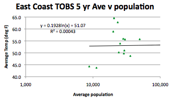 Correlation of average state temperature with local station population average along the East Coast
Well the it seems pretty clear that there was indeed, along the East Coast from Georgia to Maine, a fall in temperature of 3.6 degrees from 1949 to 1963. I don’t remember seeing such a drop in other regions of the country, but I suppose I had better check those out next.
Oh and the difference between the USHCN homogenized curve and the TOBS data is interesting (I used the areal weighted average values).
 Correction applied by NOAA to the original TOBS data for stations along the East Coast, bear in mind that this is averaged over a total of 250 stations.
Addendum
I stated at the beginning that I was checking that the drop held true for all states, but actually just summarized them without showing the individual state values imposed on one another. My apologies, and because there are 14 states I have broken the plots down into two parts, first the more southerly states:
 Variation in average state temperature in the period 1940 to 1980 for the Southern half of the Eastern Seaboard states
 Variation in average state temperature in the period 1940 to 1980 for the Northern half of the Eastern Seaboard states
The temperature drop between roughly 1950 and 1965 can be seen in each plot, validating the opening thought, but since the lower curves reflect a more northern position, it is worthy of note that the drop seems to move to the right over time, and the variation gets more jagged as one moves north.
Yet more questions!!


This comment has been removed by a blog administrator.
ReplyDeleteThis comment has been removed by a blog administrator.
ReplyDeleteThis comment has been removed by a blog administrator.
ReplyDeleteThis comment has been removed by a blog administrator.
ReplyDelete