Sunday, May 29, 2011

OGPSS - Chemical floods to enhance oil recovery

Before returning to look at the larger oilfields in the United States, I thought to describe ways of increasing the oil produced from the stripper wells that I mentioned last time. It seems appropriate to tie this to the time that I am writing about Texas, since some 41% or so of marginal oil well production comes from that state. And I would acknowledge again the help of the Stripper Well Consortium.


In the main, as Rockman has pointed out, the economics of production severely limit the options for increasing the flow of oil from these strippers. However changes in market price, and the reduction in costs of some of these treatments can make enhanced oil recovery (EOR) techniques worthwhile. And, even if not presently economic, as research studies ways of lowering the cost, driven in part by the size of the market, and the need for oil, so the likely increase in the price of that oil will change the economics in a positive (for the well owner) direction. This post is therefore going to look at the use of chemicals to stimulate enhanced oil recovery with a particular thought for stripper wells.

As an example I am going to consider the Lawrence field on the Illinois side of the Illinois:Indiana border, since this is part of an ongoing project.

Location of the Lawrence oil field in Illinois (Rex Energy )

The field had, by 1950, peaked and was in decline. However by waterflooding the field at that time, generally recognized as secondary recovery, the water displaced the oil, while maintaining pressure in the reservoir as fluid left, thus increasing production. though that too then began to decline.

Production from the Lawrence field in Illinois (DOE )

Some time ago Stuart Staniford explained some of the problems with a water flood, in terms of ultimately recovering all the oil from a formation.. The post itself deals with what is going on in the Ghawar oil field in Saudi Arabia, but, to understand that, one has to understand a little of the physics of fractional flow in a multi-phase fluid. And so he provided that explanation, which I am now going to borrow:
if there is 10% water and 90% oil in a particular volume of rock (.........), then a well into that part of the rock would be receiving 10% water and 90% oil. Similarly, an area with 60% water and 40% oil might be producing at 60% water cut into a well into that area. However, this is not so: the difference is much more dramatic than that. The reason has to do with the physics of two phase flow in a permeable medium. If you want a mathematical treatment, try this, but let me try to illustrate the basic idea.

In a set of interconnected pores through which oil and water are being forced at pressure, the flow is too turbulent for large areas of the two fluids to separate out from one another. And yet, oil and water do not like to mix, and will tend to bead up in the presence of the other. If there is only a little water and a lot of oil, then the oil will form an interconnected network of fluid throughout the rock pores, whereas the water will tend to make small beads within the oil. Conversely, a little oil in a lot of water will result in a network of water throughout the rock, and small beads of oil within that network. Now, in either situation, the fluid that is interconnected can flow through the rock without making any change in the arrangement of beads and surfaces between oil and water. However, the fluid that is beaded up can only move by the beads physically moving around, and they are going to tend to get trapped by the rock pores.

So for this reason, in a mixture of almost all oil, the water cannot flow at all. Conversely, once there is almost all water, the oil cannot flow at all (which sets an upper limit on the amount of oil that can ever be recovered by a water flood). In between, there is a changeover in which the proportion of oil flowing to water flowing changes much more rapidly than the changeover of the actual mixing ratio. The curve that describes this is called the fractional flow curve.

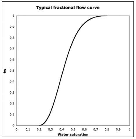
For example, the tutorial I referenced earlier shows this picture for a typical fractional flow curve:

"Typical" fractional flow curve (from this tutorial). Fw is the fraction of the flow out of the well that is water, i.e. a value of 1 is sensibly 100%.

So the way to read this is that when we are below 20% on the X-axis (less than 20% water in the oil), there is zero (water flow shown Ed) on the y-axis (the water will not flow through the rock at all). As we get above 20% water saturation, the flow of water increases rapidly, until above 80% water, there is no flow of oil at all. In the linear region at the center of the curve, the slope is about 3.6. That is, each 1 percentage point increase in water saturation results in a 3.6 percentage point increase in water flow in the rock.
Now this is not absolutely true, in that the mechanical motion of the water through the rock will drag a small fraction of oil along with it. Thus, at flows above 80% there will still be a small amount of oil that comes out with the water.

The amount of water that comes out of the well, as a percentage of the total flow, is known as the “water cut.” (And the obverse, or oil percentage is referred to as the “oil cut".) In Illinois the wells in the Lawrence field are running at a water cut of 98%. In other words for every 100 barrels of fluid pumped out of a well, only 2 barrels will be oil, and that must be separated from the water. In Saudi Arabia one of the characteristics of production that initially caught Matt Simmons attention was that the oil had a water cut of around 30 – 35%. But I’ll leave that issue to another day – though in passing, if you haven’t read Stuart’s post in it’s entirety (and the debate between him and Euan Mearns on Saudi productivity) it is well worth taking the time to do so.

What I want to return to for today is the remaining oil in the field. To put it simplistically, under normal conditions that oil is attached to the particles of rock in the formation, and the water flowing past only marginally can dislodge it and carry it to the well (hence the low oil cut numbers). Now if the chemistry of the oil could be changed, so that, for example, it did not cling quite as strongly to the rock, and, at the same time the viscocity of the oil was reduced, so that it would flow more effectively, then perhaps the water could carry a higher percentage of the oil away, increasing not only the oil cut, but also the total amount of oil that could be economically recovered from the wells. (This might also require getting the oil into an emulsion with the water).

There are a number of different techniques and fluids that can be used to make this work. The idea is not new, and back in the ‘80’s the hot topic was “Micellar flooding”, although it, and its cousin ASP flooding, have not been that successful – in the United States.

Production from chemical flooding of oilwells in the USA. (Dr. Sara Thomas*)

The letters that make up ASP stand for alkaline, surfactant and polymer. Generally the chemicals are injected as a slug, or a series of slugs, into the water injection well (s) and then pass through the formation to the collection wells, being pushed through by subsequent injections of more water.

The first of these, the alkaline chemical (think caustic), is aimed to mix with the oil and lower its bond attachment (the interfacial tension) between the oil and the rock so that it can be removed more easily. By itself, however, it does not seem have that great a level of success in improving oil cut, but it sustains the flow of the oil for a longer period.

Alkaline - polymer flood of the David Field in Alberta (Dr. Sara Thomas*)

The S in ASP stands for surfactant, and this acts in much the same way as does the alkali in changing the adhesion of the oil, but acts more as a soap in helping to break the oil free. It has been shown to be more effective as a tool for improving recovery than the alkaline solution.

Effect of a surfactant flood on well performance and oil cut – Glenn Pool Field OK (Dr. Sara Thomas*)

The polymer can either be used to thin the oil, so that it is easier to move, or to thicken the water so that it adds a more effective drag to move the oil. The benefits of this can be seen from a trial at the Sanand Field in India. Note that it also provides a more sustained effect.

Effect of injecting a polymer slug to enhance oil recovery (Dr. Sara Thomas*)

While each of these individually provided some gain, the impetus at present is to combine them in consecutive slugs (hence the acronym) and the benefit can be seen from the sustained improvement in oil recovery. (As you will note from the dates, this is not a totally novel concept).

EOR from a field in Daqing, China after an ASP treatment (Dr. Sara Thomas*).

And here is a different example from Tanner, WY.

Change in oil cut and monthly oil production following an ASP flood in Tanner, WY (Oil Chem technologies ). The cost per incremental barrel including chemical and facilities was estimated at $4.49.

With this understanding of the background to the potential use of the ASP treatment, lab tests have shown that it might be possible with this technique to recover an additional 130 mbbl from the Lawrence field. (Until now it has produced a total of 400 mbbl). The potential, if the technology can be proven to work is quite significant.

Potential additional oil that can be recovered if Chemical EOR is successful (Dr. Sara Thomas*).

The big question, that I included in my second paragraph, and that Rockman, (our resident realist) reminds us of, is the need for this to be a significant cost benefit to the operator before it will be implemented. Technically chemical floods can increase the oil cut from 1 to 20% of the flow, but in the earlier tests the chemicals used cost more than the oil recovered. It is not a simple process, since it depends on the rock geology to ensure that the chemicals have the proper access to, and path from the oil in place. And the additional services to ensure this also cost. Lawrence was the site where Marathon tried using chemical EOR in the past and achieved the technical success of increasing the oil cut to 20% from 1%) but it was uneconomic. With the new program Rex Energy are reporting, in their first quarter report, that the program is successful so far.
We are seeing positive results from the Middagh ASP project area with increasing oil cuts and oil production. . . . . . . . . . . . .

As a result, we have the confidence to increase our capital budget for the ASP program by $3 million to fund the larger 58-acre ASP project in the Perkins-Smith area. Results from the Middagh ASP are being analyzed to maximize oil recovery in the Perkins-Smith Unit. ASP injection on the Perkins-Smith Unit is expected to begin during the fourth quarter this year following brine water injection, which we expect to commence shortly.

The program is an area of considerable interest for the Stripper Well Consortium to whom I am indebted for some of the information in this post.

I would close, however, with a slide from Dr. Thomas’s presentation:

The growth of oil produced by chemical EOR (ASP flooding etc) in China (Sara Thomas)

* The graphs identified as “Dr. Sara Thomas” were taken from the SPE Distinguished Lecturer Series 2005 – Dr. Sara Thomas “Chemical EOR – the Past, Does it have a Future?” (Abstract here )

Read more!

Saturday, May 28, 2011

Kentucky combined temperatures

There are 13 USHCN stations in Kentucky, starting with Ashland, and ending at Williamstown.

USHCN station location in Kentucky

If one looks it does appear that the locations strongly favor the highway network in the state, relative to the blank areas between them, but so it goes. There are two GISS stations on the list. These are at Louisville and Lexington. And so the first thing to do is to collect the data.

There are, as it turns out three Lexington’s (GISS is still showing me European sites when I click on the map selecting Kentucky, go figure!!). Lexington/Blu has the right co-ordinates.

Lexington KY GISS station temperature plot.

And there are two Louisville stations and the one with the correct location also has data back to 1880.

Louisville KY GISS station temperature plot

Looking at Farmers KY through the Zip-code site gives a population of zero, but a glance through Google Earth shows an airport and a dam within walking distance. These lead me to give it a population of 50. (Though when I look at the plot later I suspect I should have made it significantly larger).

View of the USHCN station (where the numbers are) at Farmers, KY, using Google Earth.

Looking at the data, there is almost a constant average half-degree difference between the GISS station average and that of the homogenized data for Kentucky, using the USHCN stations.

Difference between the GISS station average and that of the USHCN stations, after that data has been homogenized.

Using the Time of Observation corrected (TOBS) temperatures, the temperature of the state actually fell over the 115 years of the period examined.

Average temperature (Time of Observation corrected) for the USHCN stations in KY.

Incidentally when the temperatures were homogenized the average showed a slight temperature rise over the period, but only 0.06 degrees per century.

Looking at the geography of the state, Kentucky runs from roughly 82 deg W to 89.5 deg W, and from 36.5 deg N to 39 deg N. It is 380 miles long and 140 miles wide. The center of the state has a latitude of 37.36 deg N, whereas the USHCN stations center at 37.6 deg N, and the GISS stations at 38.1 deg N. The elevation of the state varies from 78 m to 1261 m, with a mean elevation of 228 m. The average elevation of the USHCN stations is 212 m, and for the GISS stations 222 m.

Looking at the effects of geography:


The effect of latitude is consistent with that found in other states. In contrast, and illustrating why longitude is not a true parameter, one finds that in Kentucky as one goes West the temperature rises:


This is not consistent with the findings in most states, where as one moves West the temperature falls. The reason, however, depends on how the land is changing elevation. In Kentucky as one moves West the land lowers. This can be seen with the correlation with elevation:


However the plot here showing a significant interaction between temperature and elevation helps explain why I prefer using the TOBS data to the homogenized data that USHCN offer. If that plot is examined, as an example, one can see that the homogenization has removed the sensitivity .

Plot of homogenized temperature average for the USHCN stations as a function of elevation. (Note the change in the R^2 value).

The downside to using the TOBS data is that there are years without data on the USHCN site, hence their desire to fill in the data, and use the homogenization process to establish numbers that are not in the data base. And in Kentucky there are a significant number of stations with no TOBS data over the past five years, so that when I plot the 5-year average against population, the lack of a sufficient data base makes the correlation poor.


The drop out in recent temperature data may also explain the rather odd (relative to other states) plot of the difference between the homogenized data and the TOBS for Kentucky.


Read more!

Monday, May 23, 2011

Icelandic volcano update, and a comment on Joplin

We are all reminded of the sudden changes to plans that nature can enforce, at little notice. The eruption of the Grimsfjall/Loki volcano in Iceland continues, and there are now reports of animals beginning to die, as the ash continues to blanket the island. The ejection rate is running at around 1,000 to 2,000 tons per second, and the volcano is considered to be several times the power of last year's eruption. (It can be seen on web camera here). Airlines are allowed to fly, by UK regulation, where the ash density is less than 2 gm per 10 cubic meters of air.

Although the volcano is more powerful than last year's eruption, the magma is not shattering into as small a particle range as happened last year, the fragmentation comes when the hot magma meets the ice or water in the overlying glacier. But as the eruption continues the immediate overlying ice is all consumed, and without that the magma will flow as more conventional lava. The reducing availability of ice and water, even as the magma continues to flow, means that the problems that the ash cloud generates may be more transient than last year, where European airspace was closed for a week.

The threat to European Airspace 23 May 2011 (flight radar 24)

The cloud, which has closed Icelandic air space, is now approaching the UK, and has already caused President Obama to move his trip to the UK forward a day , so as not to be at risk from flying through the cloud. At present the cloud is close to Scotland, and it is expected that that airlines will cancel flights to affected airports. Some already have and the effects of the eruption could soon spread into Europe. However, with the changing ash size, as the water and ice is all used up, so there is hope that the ash plumes will decrease in size, and that Iceland may be able to open some airports as soon as tomorrow.

UPDATE: The picture above was taken late in the evening of the 23rd, the following picture is at around noon in the UK on the 24th, and flights are already being cancelled as the cloud becomes too dense at certain altitudes for planes to fly.


One of the questions, however, is as to whether the volcano may change from issuing from a single vent into a situation where the magma finds a second channel, which would put the second outlet back under ice, and give a secondary ash cloud. This might then spread south, giving a more continuous problem that would extend over time. The extrusion of magma from a series of vents along a fissure line is characteristic of the Laki eruptions which lie to the south of the current site.

While the impact of that natural event continues to unfold, the disaster in Joplin was there and gone in almost no time, with winds of up to 198 mph. I looked out of my window 150 miles East of there last night, and saw a storm coming in, gave it no more thought and went to bed. This morning I awoke to hear that 89 people had died, (now updated to 116) and that about a third of the city of 50,000 was destroyed. It is a city where many off the folk that work at KMT, a waterjet manufacturer in Baxter Springs KS, live and these include a number that have graduated and worked with me at MO S&T. Sadly I have heard already that three that I know as friends have lost their homes and all that they possess, and that of the six employees of the firm who did lose their homes, one also lost his wife.

Our thoughts and prayers are with them tonight.

Read more!

Sunday, May 22, 2011

An Icelandic volcanic eruption

Well this is interesting. I wrote a week ago about the pattern of earthquakes that was developing in the Mydralsjokull area of Iceland. However, earlier this year there was a growing pattern of earthquakes around the Grimsfjall region in Iceland, which is also known as the Loki volcano, There has now been an eruption in that region. And while the power of the volcano is already waning somewhat, there is some anticipation that the overall eruption might be larger than the Eyjafyallajokull eruption that happened last year, and the largest eruption at this site in over 100 years. At present the ash particles are being reported as larger than that from last year’s eruption, so that it likely won’t be as disruptive. It is also being blown northwest, and so does not threaten the main air corridors at the moment.

What makes it more interesting, and a little worrisome, however, is the line of strong earthquakes (i.e. above a level 3) that are shown by stars in the map below, and which run down from the current eruption towards Mydralsjokull, which is at the bottom. And these all happened in the last day. For convenience I have given the volcanoes their Norse names of Loki (which is where the current eruption is), Laki, which is the volcano that erupts along the line of the green stars, and Katla, which is the volcano at Myrdallsjokull. The largest of the earthquakes is a 4.6 and is down near Laki, rather than in the Loki region.

Recent earthquake activity in Iceland (Icelandic Met Office)

The recent low level of activity on the island (there hasn’t been a magnitude 3 since March, when usually there is one about every three days) suggests that there may be some energy to be relieved, and this might open one of the fissures at Laki. These are the big volcanoes which do bad things to air quality, not only in Iceland, but also often in Europe. We will have to see how this goes.

Read more!

Saturday, May 21, 2011

Michigan combined temperatures

Michigan has 24 USHCN stations, ranging from Adrian to Stambaugh and it also has 6 GISS stations on the list.


The GISS stations include Detroit, which has four stations, of which that at Detroit/City Airport has the right co-ordinates, though it also has only data from 1948. Then there is Grand Rapids, which has three stations, of which the third has the right co-ordinates, and has data going back to about 1885.

Third on the list is Muskegon which has only one site, but also only data from 1948. The fourth site is in Flint which starts in 1949. Fifth is at Sault Ste Marie which has three stations, but the one logically to choose is the USA designation. That has data from 1880. And finally there is Marquette which also has a USA designation and data from 1880.

Looking at populations, the station at Champion is in the State Park, but a look through Google Earth shows that it is near some buildings.

Champion Van Riper state park station in Michigan

So I gave it a population of 20. Other than that the data acquisition was straightforward. Looking at the results:


The influence of the change in the number of stations used is clear with the step in the 1940’s. And going from the homogenized to the TOBS temperature data:


The temperature rise has been around 1 degree every century, the USHCN homogenized data would suggest that it is actually twice that.

Michigan is in two pieces, and is surrounded by considerable volumes of water, which may have an influence on both climate and how it changes. It runs from roughly 82.5 deg W to 90.5 deg W, and from 41.67 deg N to 48.25 deg N. The geographic center is 85 deg W, 45 deg N. The latitude mean for the USHCN stations is 43.9 deg N, and that of the GISS stations is 44.1 deg N, both therefore a bit South of the mean. The mean elevation of the state is 274 m, ranging from 174 m to 603 m. The mean USHCN elevation is 264 m, and that of the GISS stations is 195.5 m.

Looking at how this affects the temperatures:


There is the clear correlation with latitude, and no correlation with longitude.


Even though there are a number of places with similar elevations, there is a clear correlation with elevation.


And when one uses the average of the past five years temperatures against population, there is a clear correlation here too.


And finally, to explain the difference between the temperature record and the USHCN homogenized values for temperatures in the state:


Interesting how many of these particular plots have that little kick at the end.


Read more!

Wednesday, May 18, 2011

OGPSS - American stripper well production

The Total (oil company) discussion on Enhanced Oil Recovery has an illustrative graph to explain why there is a growing need to get as much of the oil in a reservoir as can be economically recovered.


When the large flows of oil that I have written about previously stopped flowing from the major production fields in the on-shore United States, that did not mean that the wells from which they issued were immediately shut-in. Rather, in many cases, although the driving pressure to move the oil to the ground surface had largely disappeared, there was still a sufficient imbalance within the reservoir that oil would flow to the well. And so, before moving on to discuss other fields, I thought I would spend this space covering the pump jacks or “nodding donkeys” that dot the landscape over many of the older oilfields of the United States (and elsewhere).

These “stripper” wells that remove the final volumes of oil from a reservoir make up by far the largest number of wells, by category, that produce within the USA. The EIA reported that there were 363,459 producing oil wells in the USA in 2009. Of these 35.1% produced 1 bbl/day (bd) or less, and 78.7% (a total of 286,109) produced less than 10 bd. For Texas alone, the EIA reports that there are 141,582 wells, and 79.4% of these produce less than 10 bd. (H/t Joules Burn).

So when oil production gets this low, and intermittent, how does the owner get the oil out? The short and simple answer is that the oil is pumped out. And if the well is running slowly, then the pump won’t run all the time, but rather intermittently depending on how fast the pump fills. The original pumpjack design was put together in 1925 by Walter C Trout, and provided the basic design for the units still dotting the American landscape.

Parts of a pumpjack (Lufkin catalog).

That basic design has largely remained the same, but the instrumentation and controls have grown more sophisticated over the years. A baseline estimate of the power requirement is that it needs around 0.2 kwh/bbl/1000 ft to lift the oil to the surface. (Which is quoted as being about a 66% efficiency). Deeper wells are reported to require from 0.27 to 0.81 kwh/bbl/1000 ft. And if the wells are 4,500 ft deep that can give an electricity bill of up to $2,000. (H/t to Joulesburn for raising the topic). Part of the problem and loss in efficiency comes from the need to start and stop the pump, because of the low flow of oil into the well.

The Web site dealing with Stripper wells (those defined as producing below 10 bd) notes:
In the United States of America, one out of every six barrels of crude oil produced comes from a marginal oil well, and over 78 percent of the total number of U.S. oil wells are now classified as such. There are over 400,000 of these wells in the United States, and together they produce nearly 900 thousand barrels of oil per day, 15 percent of U.S. production.
The average stripper produces around 2.2 bd (ibid). (The 25-minute movie “Independent Oil: Rediscovering America's Forgotten Wells” can be obtained from Amazon, or by dropping a note to the Stripper Well Consortium.

Further it points out the economic factors that inhibit re-starting these wells once they are abandoned.
When marginal wells are abandoned, significant quantities of oil remain behind-- sometimes as much as 1/2 to 2/3 of the total oil. In many instances, the remaining reserves are not easily accessible when oil prices subsequently rise again: When marginal fields are abandoned, the surface infrastructure - the pumps, piping, storage vessels, and other processing equipment - is removed and the lease forfeited. Since much of this equipment was probably installed over many years, replacing it over a short period should oil prices jump upward, is enormously cost prohibitve.
The site notes that between 1994 and 2003 some 142,000 wells were plugged and abandoned, losing the remaining oil that they might have produced. This oil is sufficiently important (since it makes up about 10 - 20% of the domestic oil production, depending on what is counted) that DOE has a program dealing with Stripper Well Revitalization (covered on CNN here) and funds The stripper well consortium that investigates ways of improving the technology.

Many of the advances have focused on improving the pumping systems used in these old wells, since the old conventional plunger system are not that efficient, relative to the new units. The large number of wells means that even where these improvements are significant, it will take some period of time to get enough new units into the field to have a significant impact on overall production.
The Gas Operated Automatic Lift (GOAL) PetroPump developed by Brandywine Energy & Development Company. The pump removes fluid from the wellbore more consistently than currently available plunger lift systems. Test results on wells in New York showed a 1.5 to 2.3-time increase in gas yield using the GOAL PetroPump over other casing plunger- type tools. The tool is inexpensive to operate because it requires no external energy source and limited manpower.
One area that they have just started work on involves the use of high-pressure jetting for drilling laterals, with the work being developed by Buckman Jet Drilling Inc. Since I jet drilled my first lateral of this type back some 30-odd years ago and have some considerable familiarity with both the promises of the technology, and some of the problems and other issues that have arisen, I suspect that I will be following this in a bit more detail than I usually allow. But that too will come in a future post, for the moment I will note that, having watched the promotional video I do have some significant concerns that arose out of an earlier incident where a somewhat similar technology was claimed to be able to achieve considerable improvements in well production. In that case my concerns were expressed in Federal Court.

One other recent breakthrough that they have highlighted recently involves the conversion of the significant amounts of water than come from these stripper wells, but which is often brackish, and thus difficult to dispose of, into water of potable quality (i.e. you can drink it). In a slide presentation by Texas A&M, who developed the membrane technology used, the resulting water is compared with Evian, Perrier and similar commercial products. Given the problems that Texas is currently facing with drought this could well solve two problems at one time. Further by lowering the cost of water disposal it, like other SWC developments, can encourage the economies of these small producers and sustain their production further into the future.

Each well may not contribute much, but in the aggregate even small changes can add up, when the totality of the wells affected runs into the hundreds of thousands. This improvement in the tail of well production, sadly, is only likely to be viable in the relatively small on-shore wells and close off-shore where the costs of maintaining the infrastructure above the well is minimal. Once those costs become significant it becomes more difficult to make the economics of the process work.

I’ll talk about some of the other ideas for stimulating these wells in a post somewhat later in the series. But this, from Total, is one I have written about before.


Read more!

Monday, May 16, 2011

Wisconsin combined temperatures

Wisconsin has 23 USHCN stations, ranging from Ashland to Watertown, and I obtained the initial data on these (location etc) from the Surface stations site, before discovering that the USHCN server is back up. So, since there may be a possibility of it going down again and my losing some of the data I use, there is going to be another pause while I download the rest of the data that I need. That took longer than I thought, but now we can get back to Wisconsin.

Location of the USHCN stations in Wisconsin (USHCN )

There are three GISS stations on the list, in Milwaukee, Madison and Green Bay. And Milwaukee also appears in the USHCN. I had originally thought that it would be easy to decide which was the GISS selected station, given that it should be very close to the USHCN homogenized data, but when I compared the three sets of data they were slightly dissimilar.

Milwaukee Gen GISS temperature plot

Milwaukee Mount Mary College GISS station temperatures.

Because of the break in temperatures with the Mount Mary College, and also that it is closer to the USHCN location, I am going to assume that the GISS station that is used is the Gen one.

It was only after I made that decision and was re-aligning the data files when I ran a difference between the two stations, just out of curiosity. I took the Gen temperature from the Mt Mary College temperature, and got:

Difference between the Milwaukee Mt Mary College and the Milwaukee Gen data over time.

This has likely no meaning other than to show a possible measure of the scatter in the data from two relatively closely adjacent sites. And after having gone through this tortuous logic, it suddenly dawns on me that I have the co-ordinates of the Milwaukee station that is being used, and when I check it is the Gen one.

There were, similarly, a number of different stations available around Madison, so I chose the one that was closest to the location given for Madison on the citi-data page. It also, now that I have thought to look, agrees with the GISS station co-ordinates on the list.

Temperature change for Madison WI, GISS station.

And that only left Green Bay, which is also a station with data back into the 1880’s.

Temperatures for Green Bay Wisconsin GISS station.

So now we have the data, after having added the populations of the different communities, and we can go through the conventional analysis.

Difference between the GISS station mean and that of the USHCN stations in Wisconsin

This trends the other way from the usual one, but that may be because, as we will see later, there is a stronger "homogenization" of the USHCN data for this state than is also usual. Over the 115 years, the temperature of the state has increased at the rate of 0.6 deg F per century. (The homogenized data suggests a rate of 1.6 degrees/century).


Looking at the effects of geography, Wisconsin is 310 miles long and 260 miles wide, running from 86.82 deg W to 92.9 deg W and from 42.5 deg N to sensibly 47 deg N. The central latitude is at 44.43 deg N. The center of the USHCN stations is at 44.1 deg, while the GISS stations center around 43.5 deg N. The elevation of the state goes from 177 m to 595 m, with a mean elevation of 320 m. The USHCN mean is 265.8 m, while the GISS station mean is at 221 m. The impact that these values have on the true mean temperatures of the state may be seen when one considers the effects of geography.

First that of latitude, using the TOBS data since the USHCN homogenization tends to weaken the correlation coefficients for most of these relationships.


For longitude, though I may soon stop including this since the correlation is a dependant one, we get:


There is the expected stronger correlation with elevation.


And since I decided to use the 5-year latest temperature average to correlate with population, we get:


And then there is, of course the result when we subtract the original raw data (time of observation corrected) from the “homogenized” data prepared by the USHCN.


Read more!