Showing posts with label Montana. Show all posts

Sunday, October 16, 2011

A new book and the temperatures in the Mountains

One of the many significant salient points that Donna Laframboise makes in her new book on the IPCC lies in the predilection of the IPCC authors to rely on computer modeling over factual data. I will probably have more to say on this in my planned review of the book (which so far is fascinating to read and damning in the details) once I finish it, but it does suggest that posts such as these on the actual variations in US temperatures over the past century will languish in outer darkness – oh, well!!

To recap where we are, after looking at the temperatures of the individual contiguous states of the American Union, I have started to look at regional changes and to compare them. A significant drop of around four degrees Fahrenheit that occurred between 1950 and 1965 along the Eastern Seaboard, and which inter alia led to a southern migration of the black-capped chickadee, has since been reversed in the warming of that region post-1965. In contrast in the middle of the country there has been sensibly no warming trend since 1895 (which might explain why the Governor of Texas finds it harder to believe in global warming, since his state hasn’t seen any).

Yet on the West Coast the trends show a relatively consistent increase in temperature since 1895. And so the next place to look is to see what happened in those states that lie along the Rockies and provide the mountainous barrier between the West and the Middle. In the following post I am going to derive this graph, and comment along the way as I get there.

Average variation in time for four regions of the country, with the results adjusted as shown to separate the curves, and show them in order (bottom to top) from West to East.

For this exercise I am going to include Montana, Idaho, Wyoming, Nevada, Utah, Colorado, Arizona and New Mexico . I have previously used both the homogenized data from the USHCN and the Time of Observation corrected (TOBS) data, with a preference for the latter since, as I noted with the individual state evaluations, it has shown a consistently better correlation across the states with latitude and elevation than the data after manipulation.

Combining first the average temperatures for the states, using the homogenized data, one gets a relatively flat curve, but one with a decided kick over the last thirty years, the sign that many consider the marker for Anthropogenic Global Warming.

Average of the state temperatures for the Mountain Region, averaging the values for the different states in the region.

However, before there is much comment on this, it should be noted (when this is compared with the figure above it) that that trend is not as clear in the four regions as I ultimately graphed them. But before getting to that let me just put up a set of comparison graphs, using the USHCN homogenized data, to show that the temperatures of the eight states that I looked at appear to vary relatively consistently. By setting them one above the other it should be easier to cross-compare.


These are relatively consistent, though they appear to smooth a bit with movement south, but to get back to that kick in the end of the plots. As you may know, and I have commented in the individual state plots, the USHCN data is “homogenized” from the raw data. When one takes the average of this “manipulation” and subtracts the Time of Observation corrected values from it, then one gets this curve as the average change made by the climate scientists in reporting the values for the stations in the evaluation (all 233 of them).

Difference between the average USHCN homogenized temperatures and the raw temperature averages, as corrected for time of observation (the TOBS values).

Given that, the rest of the analysis will go back to using the TOBS values. Firstly this changes the average a little:

Average temperatures for the Mountain states, using the Time of Observation corrected raw data.

The change in the slope of the curve drops the rise in temperature per century from 1.7 deg F to 1.08 deg F.

However this curve was obtained by just averaging the average state temperatures, there are varying numbers of stations and varying areas for the different states. When one weights the value by the relative number of stations in the state (equivalent to averaging all the stations in the region), then one gets:

Average temperatures for the Mountain states, using the Time of Observation corrected raw data and averaging the 233 stations in the region.

In each state, the area that each station “covers” (i.e. the area of the state divided by the number of stations) varies from 8,500 sq miles in Nevada, to 2,123 sq miles in Utah. To try and account for this I have weighted the state values by the areas of the states, and this gives this plot:

Average temperatures for the Mountain states, using the Time of Observation corrected raw data and weighting the state averages by the area of the state.

With this plot the steadily increasing temperature suggested in the USHCN plot does not appear as evident, and the temperatures since about 1990 seem relatively steady.

So how do the regional values now compare?

Comparison of average temperatures for the different regions of the United States (as I have defined them)

Obviously the mountain temperatures are lower than those of the other regions given that there is a fall in temperature with elevation. For the combined region this looks like this:

Variation in state temperature as a function of average station elevation in the state.

The r-squared value is much lower for this than it is for the individual stations in the region, and so I will have to look at the effects of latitude, elevation and population separately.

But to conclude I wanted to see how the temperature patterns changed across the country, and the overlay of the regional temperatures made that a little difficult to see, so I “shifted” the curves by adding and subtracting temperatures from each set, so that the comparison of shapes could be made, and that is where we came in:

Average variation in time for four regions of the country, with the results adjusted as shown to separate the curves, and show them in order (bottom to top) from West to East.

Read more!

Thursday, August 11, 2011

OGPSS - North Dakota and the Bakken shale

Nick has pointed out that the chart I used last time, in writing of the production in the deep waters of the Gulf is out of date. North Dakota is heading for second place behind Texas, having passed Oklahoma, and has the ability to pass Alaska in a few years. In May the state was averaging a production of 361 kbd of oil, and 361 bcf of natural gas, from a total of 5,570 wells (all three figures being all-time highs). Gas flaring, at the moment, is at around 29%. The current rig count is at 183 and also an all-time high. So where is all the excitement? It is not in shallow gas given that, as the Director of the Department of Mineral Resources has noted::
North Dakota Shallow gas exploration is not economic at the current price.
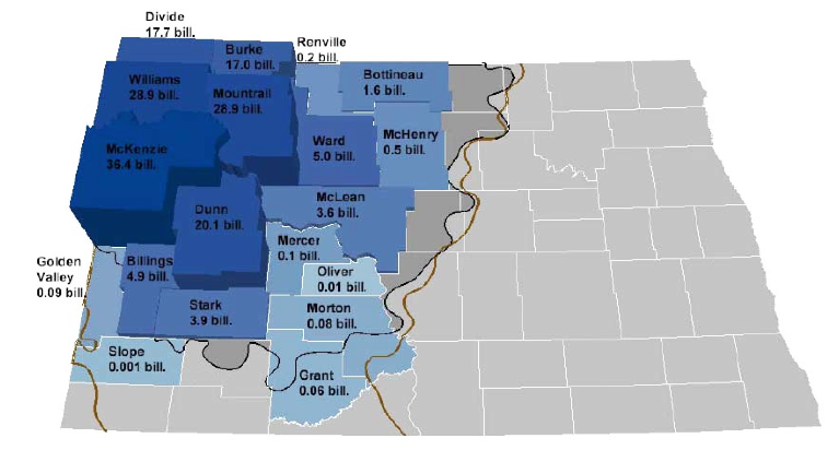
The answer lies in the Bakken and Three Forks with rigs that can drill more than 20,000 ft being the most actively employed. The Bakken has already been discussed in an earlier post at The Oil Drum and I don’t really want to repeat much of that information, and so this presentation will, perhaps, rely a little more on visuals. The Bakken and Three Forks partially lie in Western North Dakota, and the Department of Mineral Resources (DMR) for the state, has shown how the total Original Oil In Place (OOIP) estimates vary from county to county within that region.

OOIP estimates by county (North Dakota DMR)

The state has also produced some three-dimensional models of the formations in the region around Williston, which is where some of the most productive wells are found.

Region of North Dakota that is modeled. (ND DMR ) The sides of the square cover 135 miles.

By developing the model it is possible to look both at the section showing the location of the productive beds in the region. Since the Department covers other valuable minerals beside oil and gas, they are also shown in the section:

Section through the ND geology (ND DMR )

The Bakken lies at a depth of around 11,500 ft with the additional need for rigs to drill 20,000 ft coming from the use of horizontal drilling along the formation, which is typically only around 150 ft thick. One of the advantage of the model is that it can be used to generate a view of the Bakken itself, with the overlying ground removed. This also helps show that, while the above section shows the beds lying in a syncline, where oil might be expected to migrate out and up the sides away from the central dip, there is a central anticline where oil could be trapped, and the structure is not smooth. (Bear in mind also the scale of the model, so that small traps in the field are not picked up at this level. ) The structure of the shale beds themselves also make it less sensitive to geological modifications which drive oil migration, though obviously not completely or else there would be little oil flow to the well.

Model of the Bakken formation around Williston (ND DMR )

The dominant feature that runs relatively North-South through the center helps then explain the location of many wells drilling into the reservoir.

L:ocation of wells in the modeled region of North Dakota (ND DMR )

While the formations have been known for some time it was only with the development of horizontal wells, and fracking capabilities, that the opportunities to extract the oil became viable. To borrow a picture from that earlier post by Piccolo (H/t Gail)

Change in Bakken production with the introduction of horizontal wells and Fracing (TOD)

As the number of horizontal wells has grown one finds, as I noted above, that 20,000 ft of drilling will include perhaps 9,000 ft of horizontal well in the formation itself. Such a well, as for example the Credo Petroleum well that is cited, may initially produce 1,267 bd of oil and 1.24 mcf/day of natural gas.

However one of the concerns that has been expressed, both by Art Berman, and later myself, has to do with the long-term production rate from long horizontal, frac’ed wells in shale, and it is therefore instructive to see the information that is now available on a typical well, which has been compiled by the ND DMR.

Typical Bakken well production (ND DMR )

At the time of the presentation (last year) there was still a large proportion of the gas being flared.

Gas flared as a percentage in ND (ND DMR )

Since then, as I noted at the start of the piece, the amount flared in May of this year has risen to 29%.

There is a more than adequate array of pipelines to handle the fuel that is being produced, at the moment it is the oil that is the critical, and valuable component. But even with a projection that the state will see about 2,000 wells a year being drilled over the next few years, with the expectation that the field will last some 20 years, the overall production is not expected to increase much beyond the levels that it is now attaining. This is because of the relatively rapid drop in well production, for which there is now a considerable data base. That doesn’t stop some from projecting, however, that the field can increase in production to levels as high as 1 mbd or so. That would, of course, include production from Montana and Canadian parts of the Bakken, which I have not discussed here.

One point that should be noted is that the lease rates for Bakken in North Dakota are quoted as being around $7,000 to $8,000 per acre, while those in Montana are reported to be considerably less. To date there has not been that much activity in Montana, though with time this will change. Already permit numbers are rising, and there has been some success to equal that in North Dakota.
Brigham Exploration, one of the most aggressive in Montana, recently unveiled five wells there ranging from 909 boe/d to 2,962 boe/d, the latter volume a "record for the state," Pritchard said. The five wells averaged 1,579 boe/d.

At present, however, most of the rigs (170 to 10) remain on the North Dakota side of the border. That too will change, with time.

Overall the Bakken is likely to see further increases in production as the areas being drilled expand, but with the relatively short life of the well at significant levels of production, it is harder to see the higher levels of production overall that others have cited, and one also has to remember that is often the sweetest spots that get drilled first.

Read more!

Wednesday, August 26, 2009

Camelina - a relatively new US biodiesel source

So what the heck is Camelina? Until I read that it was used as the greater source of the biofuel component for the test flight of the Japanese Airlines plane in February I must confess I had never heard of it. So since it has obviously got some legs (there was a greater percentage of it than of the algae derived fuel) herewith some thoughts picked up as I wandered through some Web pages, seeking more information.

Camelina in a Montana test plot

Apparently it came to the United States out of Europe, though it started out in Central Asia and the Mediterranean. In Europe much of the early cultivation of the crop has been replaced with canola fields, and it appears to compete with it as a crop. It arrived in Montana in about 2004 where it appealed both to farmers – as a source of omega-3 fatty acids, and to researchers who were looking for a source of biodiesel. The early work suggested that it could be sold more cheaply ($2 a gallon in 2005) than soy-generated biodiesel ($3 a gallon), but a cheaper price is hardly guaranteed to induce farmers to grow it. The oil has historically been used for cooking, with the meal fed to animals.

Recent interest in the plant was spurred by the omega-3 content
there is renewed interest in Camelina for its oil which is rich in the omega-3, alpha-linolenic acid (ALA).Ironically, this quality had contributed to its decline, due to difficulties with hydrogenating the highly unsaturated oil for margarine. Linseed (60% ALA) and Camelina (45% ALA) oils are by far the richest plant sources of omega-3.Rapeseed has lower levels of ALA (10%) and sunflower almost none. Camelina oil is more stable than linseed, due to its natural antioxidants, which also have health benefits in their own right.
It is a branch of the mustard family, and has the benefit over canola in that it is resistant to flea beetles, which are a problem for canola in Montana. Like canola it prefers cooler climates;for greatest yields being planted before the 15th – 20th March in Montana with harvesting in Late June to late July. (Similar dates hold for planting and harvesting in Wales.) Thus in 2006 there were somewhere between 7,000 and 20,000 acres planted in Montana, in 2007 this grew to 24,000 acres. It also has the benefit, over canola, of being able to survive drought and spring freezing. Further there is a winter variety that can be grown in areas with mild winters. The report from Montana State describes the oil content as:
Camelina oil has unique properties. The oil contains about 64 percent polyunsaturated, 30 percent monounsaturated, and 6 percent saturated fatty acids. Importantly, camelina oil is very high in alpha-linolenic acid (ALA), an omega-3 fatty acid which is essential in human and animal diets and has important implications for human health. The oil also contains high levels of gamma-tocopherol (vitamin E) which confers a reasonable shelf life without the need for special storage conditions.
In comparison to canola (rapeseed) which produces some 127 gal/acre camelina is reported to produce in the 62 to 100 gal/acre range.

Field trials of production showed a wide range of results from 330 to 1700 lbs of seed per acre, with oil content varying between 29 and 40%. There are however a significant number of varieties of the plant and thus tests have been carried out to determine which might yield the better crop given the Montana growing conditions. Optimal seeding rates seem to be in the 6-8 lb/ acre range, because the small size of the seed (400,000 seeds per lb.) apparently make it more difficult to ensure germination and achieve an optimal plant density of around 9 plants/sq. ft. It does apparently grow better when the ground nutrients are supplemented with nitrogen up to levels of 80 lb/acre.

The Montana report ends with the following
At this point there are many more questions than answers when it comes to camelina production and use. Early experience in Montana has shown that with good management, and timely planting, good crop yields can be attained. As a broadleaf cool season crop, camelina could become a good complementary crop to wheat, providing a needed break from cereals in wheat production. Crop rotation is a great way to reduce disease and insect pressure for any crop, and there are few good economic crop rotation options for wheat in Montana. Weed control is a major limitation to camelina production. Currently there are no herbicides registered for use with this crop, which means rescuing a field that becomes infested with weeds is difficult.
However varieties of the plant produces its own herbicide.

Data on crop production is still somewhat limited since the USDA did not start data collection until 2007, and the 2008 report was issued this April. Production in Montana in 2008 was significantly down (at 12,200 acres) over that of 2007. The average yield was 569 lb/acre, down 4.8% over 2007, though the range from 400 to 1000 lb/acre makes it unlikely that any conclusion can be drawn from those numbers.

The Welsh report comments on the current extraction process
Camelina typically contains approximately 35% oil. Cold pressing is not 100% efficient, the proportion of oil extracted being dependant on the type of seed and how well the press is set up.

As an example, a tonne (1000 kg) of Camelina will contain 350 kg of oil, of which the press will extract 250 kg. Cold pressing (400C) is required, because high temperatures will damage the antioxidants. Drought, lack of sunshine during seed formation, herbicide desiccation applied too early, and downy mildew infection may all lower the oil content of the seed.
In Wales they can get up to 1 t/acre.

Oregon is considering growing the crop after looking at trials in nearby states
Under dryland conditons in Montana, camelina is expected to yield 1,800 to 2,000 pounds of seed per acre in areas with 16 to 18 in hes of rainfall and 900 to 1,700 lb/acre with 13 to 15 inches of rainfall. Under irrigation, seed yields of 2,400 lb/acre have been reported. Three years of yield trials at Moscow, Idaho show a 2,100 to 2,400 lb/acre seed yield potential with 25 inches of rainfall.
. At present there are restrictions on the growing of canola in Oregon
Oregon officials in 2005 restricted canola-for-oil production in the valley to protect the valley's high-value vegetable seed crops. Officials recently announced they are going to renew the prohibitions.

"I would like to grow canola, but the state interferes with that, too," Van Leeuwen said.

Fears are canola will attract insect pests common to canola and brassica crops and that canola will cross pollinate with cauliflower and broccoli, lowering seed purity and eventually driving vegetable seed contractors out of the valley.
Camelina may overcome some of those concerns.

So my quick look suggests that it about on a par with canola (rapeseed) with some survival benefits over that plant as a crop, that it is only just being introduced into the United States as a crop and that, while it has potential, and there are some productive strains identified, it is still a little early in the game to know if it will pan out quite as well as the Biofuels Digest suggests.

Read more!

Monday, April 27, 2009

The risks of "cap and trade"

When discussions arise about Climate Change, and the possibility that carbon dioxide and the other greenhouse gases are responsible for the rise in global temperatures, one prevailing argument is that “we cannot afford to take the risk of the AGW argument being right, without doing something.” However, in that discussion, there is rarely any mention of possible negative consequences to mitigating against increased levels of carbon dioxide in the atmosphere. The only positions mentioned are frequently the projections of dramatic rises in sea levels, the promise of worse storms, droughts and climate conditions and other projected severe costs of inaction. The costs of the actions themselves are not addressed, and the implications are that the world will be a better place if some of the current trends in Climate Change are, if nothing further, stopped from progressing further.

But there are costs to the required changes in lifestyle that a reduction in carbon dioxide production will require, and those potential impacts are rarely spelled out to the public, or to the politicians who must enact the legislation to put new laws in place. However politicians, particularly in those districts that are likely to be impacted by the changes in regulations, are already showing some sensitivity to the potential negative aspects of “cap and trade” and so it might be worth exploring the topic in a little more depth.

The Energy Summit in Columbia last week allowed some of the utility companies to spell out the levels of cost that will be incurred if cap and trade legislation is enacted, based on a projected cost for the allowance to generate a ton of carbon dioxide. But they largely built their discussion around the price of that portion of the electricity that they will still be allowed to generate. A cap and trade system, however, comes in two parts. The first part is to look at the overall production of carbon dioxide, say 6 billion tons/year, where the program cuts this back by, say 500 million tons a year. (This is the reduction in the capacity to produce or the “cap.”) For the sake of the following discussion I will assume that 1 ton of coal produces very roughly 3 tons of carbon dioxide to make the arithmetic easier.

The first argument of those who look at this problem of a reduced supply is to suggest that the gap can be met by improving efficiency of electrical use, and conservation. However the implementation of a cap and trade policy is not predicated on that efficiency change happening, but it will occur as a separate event. And Jevons Paradox will tell you that “improving energy efficiency increases energy consumption.” So that the savings in power required are unlikely to be realized.

Which means that if the utilities are restricted in the amount of power that they can generate with carbon-producing strategies, then they must have alternate supplies in place. Theoretically that may well be the case. The number of states that are including a “sustainable source” quotient in their mandated supplies is steadily growing. However, as Montana, for example, is discovering there may be a difference between the targets and the practical realities. As credit has become tight, available funds for new farms are becoming harder to raise, and without a perceived increase in demand, it is harder to justify a new investment in plant when the old coal plant is still producing at a relatively low cost. And without the lead time being used to produce the new energy sources that will be needed, when the time comes to flip that switch, it may not yet be connected.

The problem actually is a little worse that this. Because most of the coal-fired power plants are quite old, and while maintained to continue to produce power, they are less efficient and more polluting that the more modern plants that are planned to replace them. But with the anticipated change in regulation now that EPA has ruled on carbon dioxide , almost all the originally about 200 planned new coal-fired power plants are holding back on commitments and roughly half have cancelled or indefinitely postponed their planned construction. Thus the increased supply of power from new plants may not appear.

There are two additional thoughts to consider. The first is the proposed restriction on emissions from these new plants:
The (Waxman – Markey) proposal unabashedly bans new coal-fired electric plants. In 2009 new coal-fueled electric plants are limited to 1100 pounds of carbon dioxide per megawatt-hour (MWh) and 800 pounds after 2020. Present fossil-fuel electric plants emit the following pounds of CO2 per MWh: 2100 for coal, 1900 for oil, and 1300 for natural gas. . . . The bill that includes "security" in its title limits our plentiful secure coal supply to discharges of about one-half that allowed for oil and natural gas.
The second is that some parts of the country do not have the ability to tap into the wind and solar resources that are currently being suggested as the solution to the problem.

Productive wind is only available in a limited number of states and their regions, and similarly solar power cannot be relied on in a North-Eastern Winter. One cannot legislate an alternative technology that does not yet exist to fill in the gaps between what will be allowed from the power plants of yesterday, and the demands that a rebounding economy may place upon them. Mandating that the older suppliers of power close, before the new plants to replace them are installed will have significant consequences to the available jobs that can be supported, if the factories and industrial base begin to lose the reliability of the power sources that they have today.

Even, however, if they find some way of meeting the target for the renewable portion of their portfolio, the utilities won’t be out of the wood. Because the purchase of the allocation for the carbon dioxide they do admit will also bring additional cost. As noted at the Energy Summit a price of $50 per ton of carbon allocation would likely double electric bills in Missouri. Burning a ton of coal, that now costs $50, would raise its price to $250. While if the price per allocation ton was raised to $200 per ton (which has been suggested as being necessary to support some alternate energy choices) this would raise the cost by a factor of five (i.e. a current electric bill of $200 would rise to $1,000 per month). In much the same way as Secretary Chu recognized at the EIA Conference that increases in the cost of oil contributed to the severity of the recession, one can equally imagine that a similar effect will be felt with an equivalent rise in the cost of electricity.

The current path forward, with a hesitation in construction of new power plants holds the risk that the United States will not have the power that it needs in the future to match industrial and domestic demands. In those cases it is often industry that is the first to see the cutbacks in supply when load shedding is needed. But the resulting drop in production, and international competitiveness, may well damage or destroy the recovering economy after this recession comes to an end. That too is a risk that should be protected against.

Read more!

Friday, January 2, 2009

7. The limited Energy Growth Options of the Future

We’re now getting closer to the start of the new Administration, with President-elect Obama having travelled to Washington, to begin his residence there. And, with his arrival, one can start to look forward to the change that his Administration is going to bring, in many of the Departments that form the Federal Government.

Obviously the one that most concerns this site is going to be that of the Department of Energy, although rulings from the EPA on the future of coal power plant emissions, and a number of issues that relate more to the Departments of the Interior and to the Department of Agriculture will also impact the supplies of energy that we will need more critically as the Obama years develop. Given the very clear message that the nominees to head these various divisions have already articulated in regard to the need to move away from technologies that are being blamed for climate change, one might, at first think that their path forward was clear, but I suspect that a harsh dose of reality is going to temper some of the steps that lead into that path.

Consider first of all the options that have prevailed until now, in the basic forms of energy that we use, and how those must change in the future. It was over at The Gristmill just over a week ago, that Sean Casten gave this table on recent power construction:
Our total U.S. electric grid has a peak capacity of just over 1,000 GW. (That's 1 billion kilowatts or, if you prefer, enough to power 10 billion hundred-watt light bulbs.)
Of that total, here's what we've installed just since 1995:
~200 MW of solar PV

~10,000 MW of wind

~45,000 MW of combined heat & power

~200,000 MW of natural gas (about half of which was combined cycle, which runs at almost 2x the fuel efficiency of the U.S. grid)
He then goes on to note that in the same time interval there has been no construction of coal or nuclear power plants.

In the same time interval the amount of ethanol produced from corn in the United States has grown to meet mandated demand, with the stated goal of having this at 15 billion gallons/yr by 2022, by which time ethanol from cellulosic sources is mandated to reach at least 16 billion gallons for a total of 36 billion gallons of renewable fuel a year (that’s 2.3 mbd roughly). By September 2008, the industry was producing 0.64 mbd against a demand of 0.69 mbd. In November the largest ethanol producer, VeraSun, filed for bankruptcy protection.

Cellulosic ethanol, as I noted last week has yet to yield any significant production plant performance.

So here you are with a clean slate, and where would one then start developing future supplies. One could presume that the initial thought would be “more of the same,” particularly given the lack of other alternative options in the immediate future.

That would imply, given the hostility toward coal that is evidenced in at least some of the remarks attributed to Dr. Chu about this being his worst nightmare, that the focus remains on solar power, wind and natural gas.

And that is where the rub comes in, for there are a number of issues that will start to come to the fore as the current technologies move closer to larger-scale adoption.

Consider, for example, solar power, Robert Rapier recently invited Tom Standing to comment on a couple of these, and he looked at An Arizona Plant and a review of plans in France. His conclusions, that a 280 MW plant in Arizona would cover about 6 sq. miles (at 50% collector density) and produce around 1.8 billion kWh per year. This is about 2.3% of the growth in U.S. electrical demand per year. Thus even if the plants could be made sufficiently cost-effective that they can compete with the cheaper electricity from coal and nuclear (in delivered cost/kWh) they are unlikely to be a major player within the next few years. And that perhaps reflects the percentage of the total build of the last decade.

Moving on to wind turbine development, this is very much a question of where to put them to best advantage, and how then to distribute the power.

Montana, for example, has lots of wind potential, but as Ben Arnoldy in the CSM points out there are two problems left unaddressed. The first is the installation of transmission lines to carry the power to where it is going to be used, and the second is the provision of standby power for when the winds don’t blow. And here one comes back to that comment about coal again, because the logical back-up might be a coal powered plant, given all the coal in Montana. However, the resistance of the new Administration might be such, that the development of coal bed methane might be a better alternative, although there is some opposition to the idea.

But that brings us back to natural gas, which is where, in the above table, some 80% of the power growth has been. And this is a real concern, since the presumption is, in much the same way as has been presumed in Europe, that there will be enough natural gas going into the future, not only to supply the existing plants, but also to supply the growth needed in the future. And that is where there has to be concern.

As I pointed out in an earlier post back in my Oil Drum days the current oversupply of natural gas in this country is based on increasing amounts of production from wells in the shales of the country. These wells are expensive to create and relatively short in life. Betting the whole of our energy future on them seems to be highly rash.

Which brings us back to the apparently unacceptable options of coal and nuclear power plants. It will be interesting (since the utility companies seem to think that they are the best option, given that they are planning on installing more than 100 of them) to see how this plays out over the next four years.

Read more!